is a colour I’ve grown to love. It’s not an exotic colour - it’s more like a school uniform colour, or a airport lounge kind of colour. It’s corporate, it’s inoffensive, it’s easy to mix.
as I’ve been exploring with burgundy, I’ve been weirding the pallet into some of the strangest combinations.

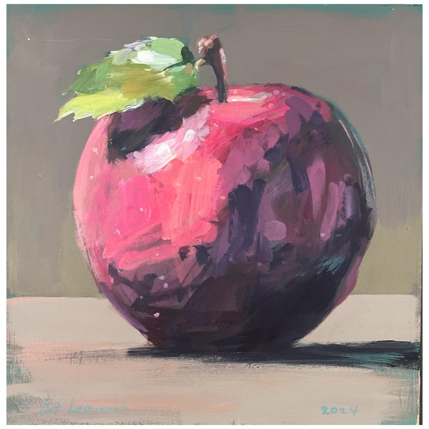
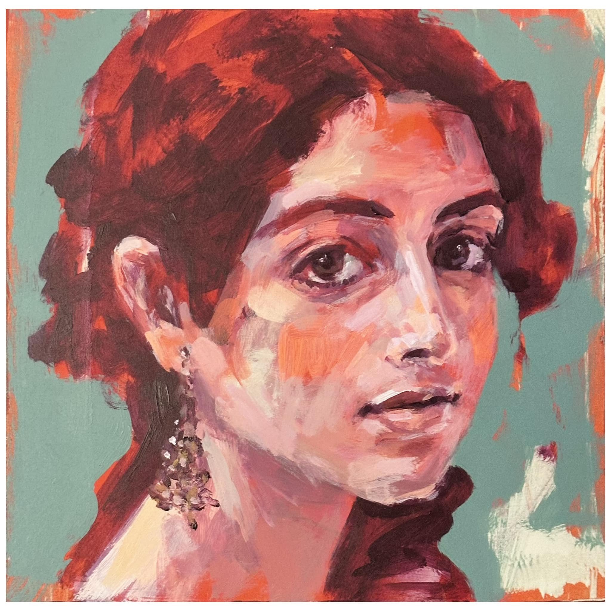
Burgundy and Orange
I used both permanent orange and fluro orange to up the bright factor
So after using Burgundy in a number of paintings over the past few weeks (or months even…loosing track here…)…
…I set myself another challenge - to close my eyes and choose a colour at random from my paint box to work with my next burgundy painting.
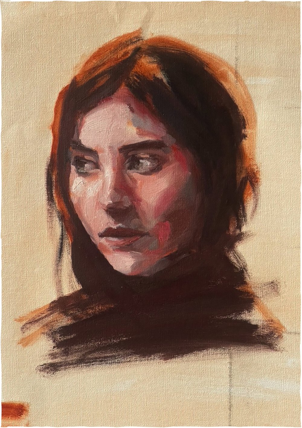
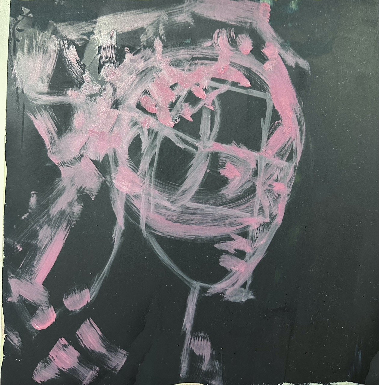
Mars Grey. …I was a little disappointed at first…not sure why because this was a recent purchase and I haven’t used it as yet. Anyway, as fate would have it I closed my eyes again and selected another colour - Crimson. What? too much like orange… I put it back and decided to go with my first pick.
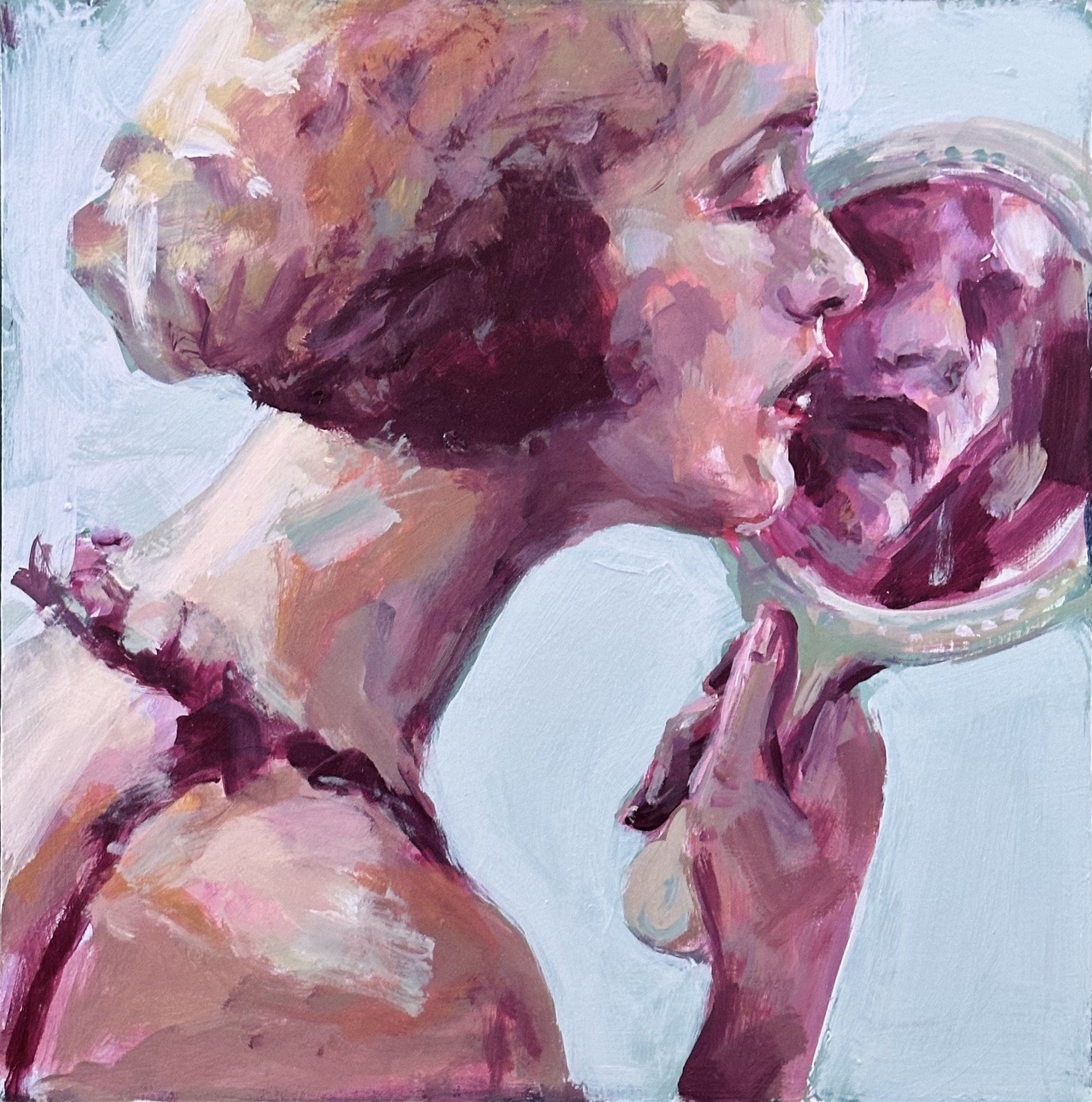
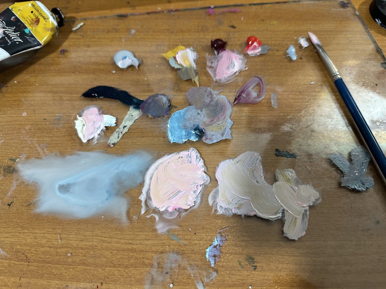
…using mars grey and burgundy I map out a head on a board that happened to be primed with Midnight Blue.
It doesn’t take long for me to want to add another colour so I add yellow ochre and the background colour, midnight blue, to my pallet and I see how far I can get with these colours.
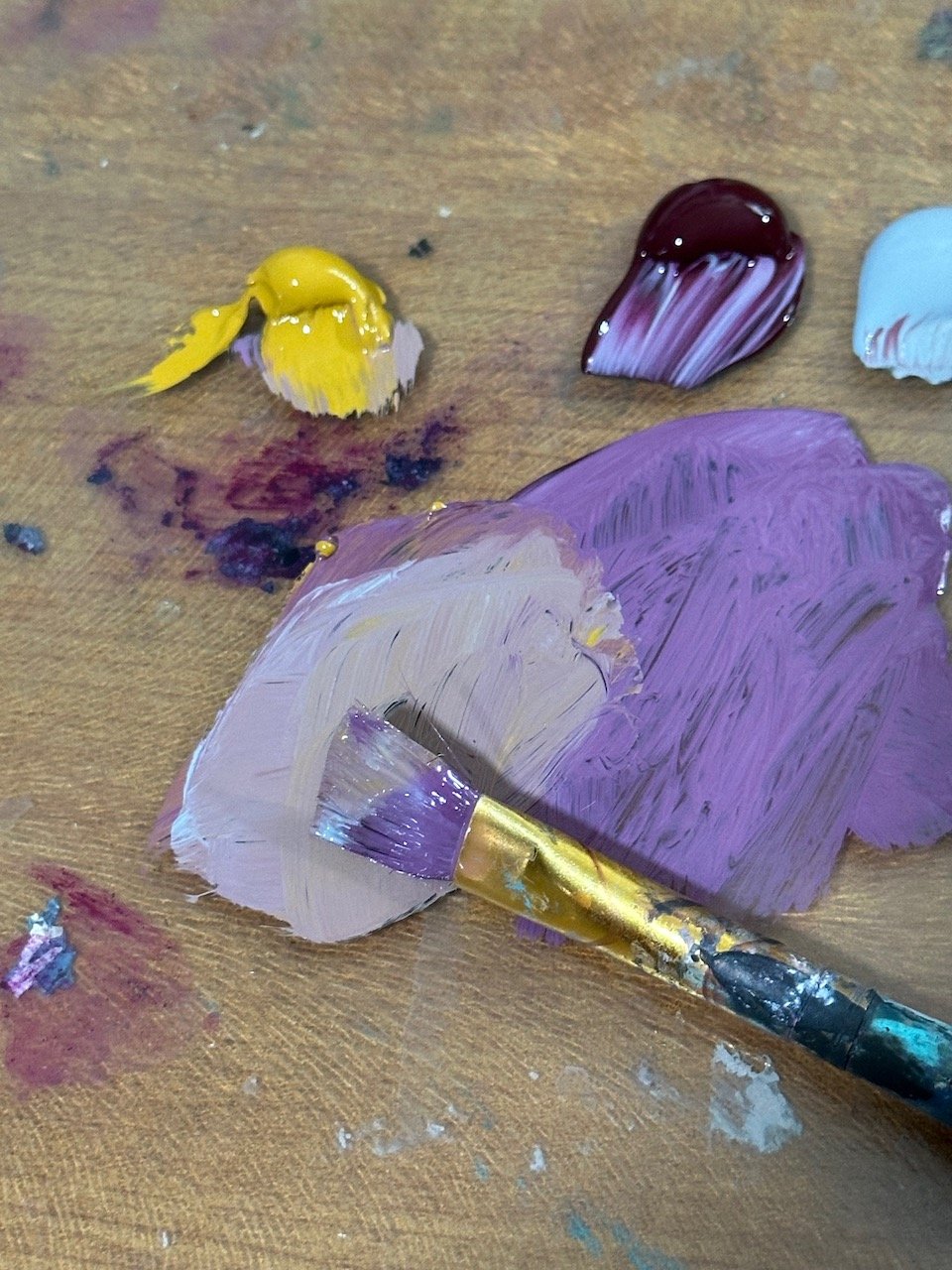
I don’t want to do more than I have to at any stage of the painting process because I love the effect of the economical paint marks at the early stages of painting - to keep these it’s important not to over work the painting and to do that realise that I need a warmer light…some kind of white or very light pink/yellow so I can get some light tones that are different from the grey. Decisions…decisions…
I add the crimson (my second blind choice) and vintage white to my pallet. The light’s I’m already using look really light against the black background but when I add the white you can really see how dark the other lights are.
it’s about now I consider changing the background colour, or doing something with it…more decisions….decisions…
really when you think about it, painting is alot of decision making.
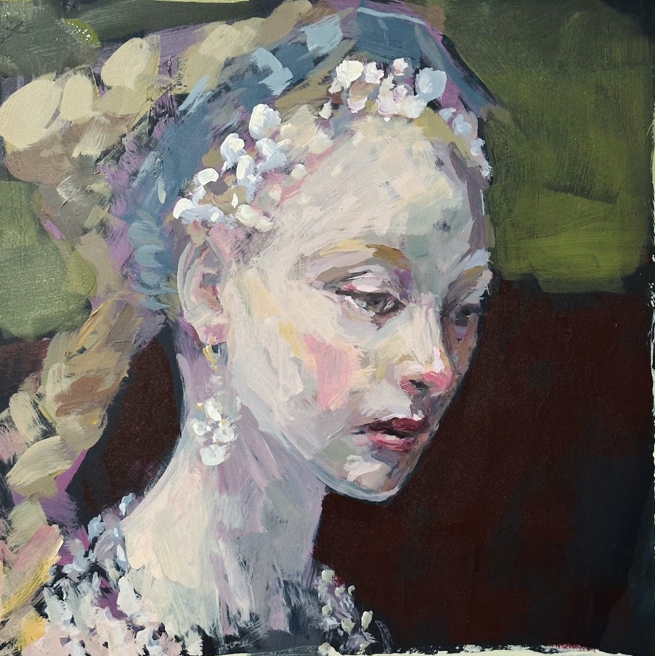
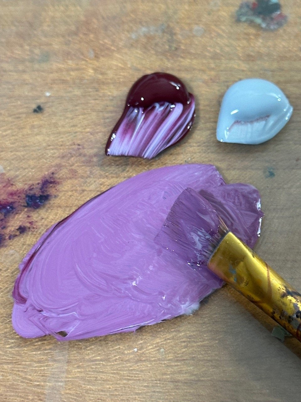
I test burgundy first…used up what was left on my pallet and then I try olive green light…a new colour I bought the other day so I thought I’d give it a go. I like it
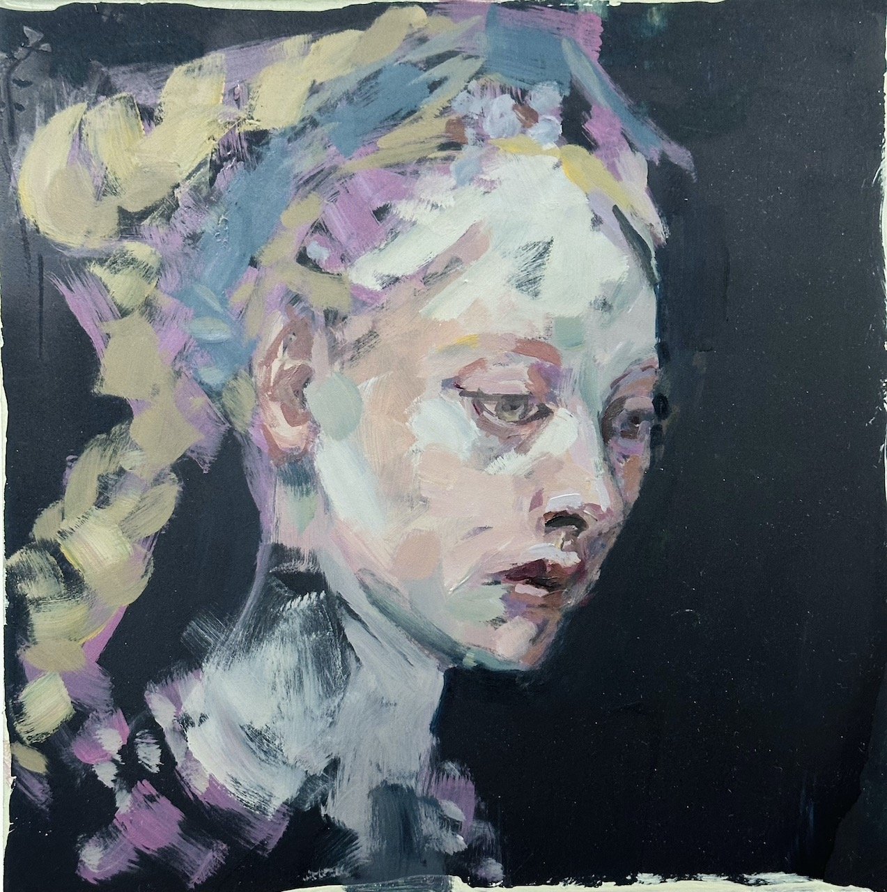
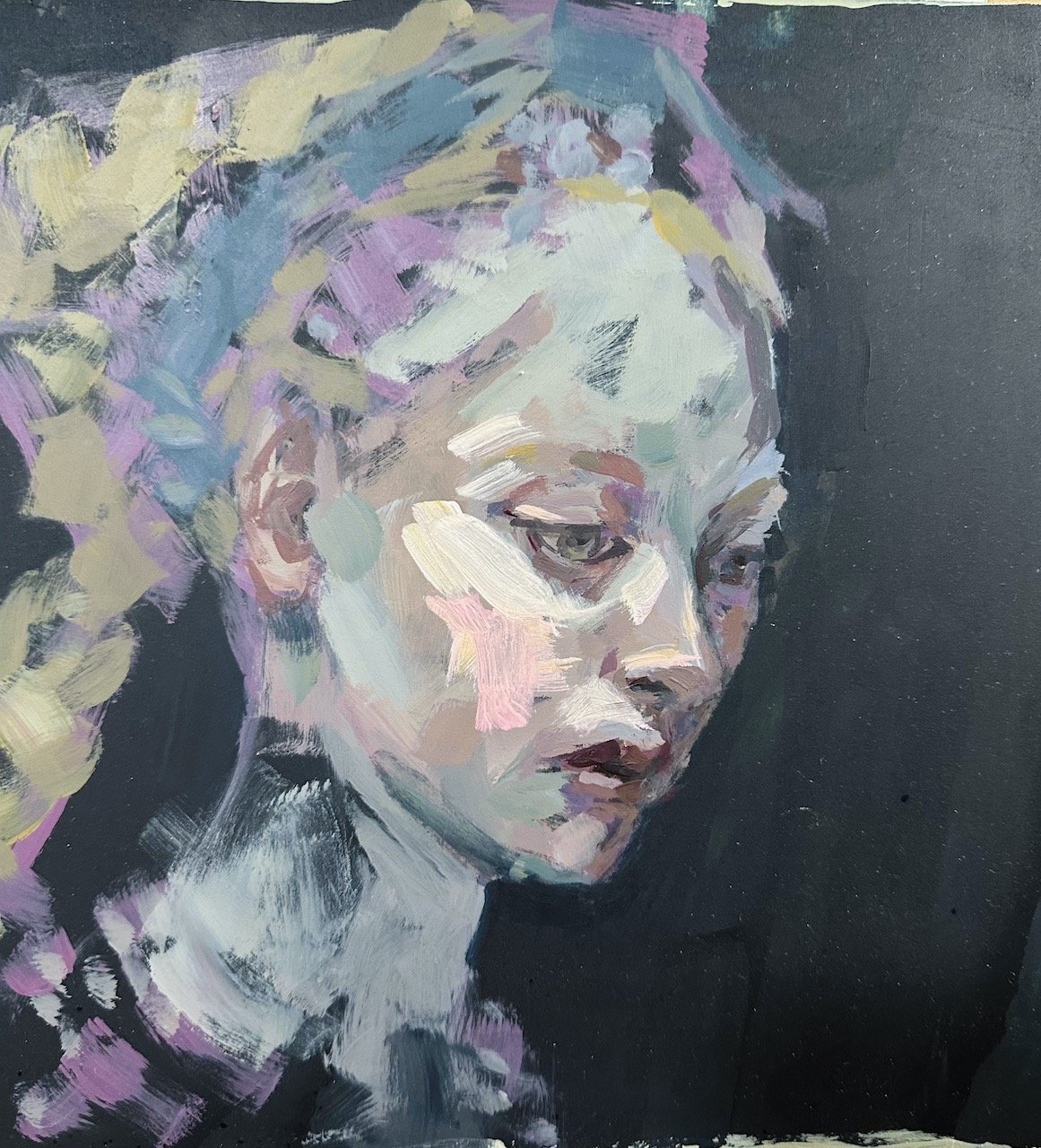
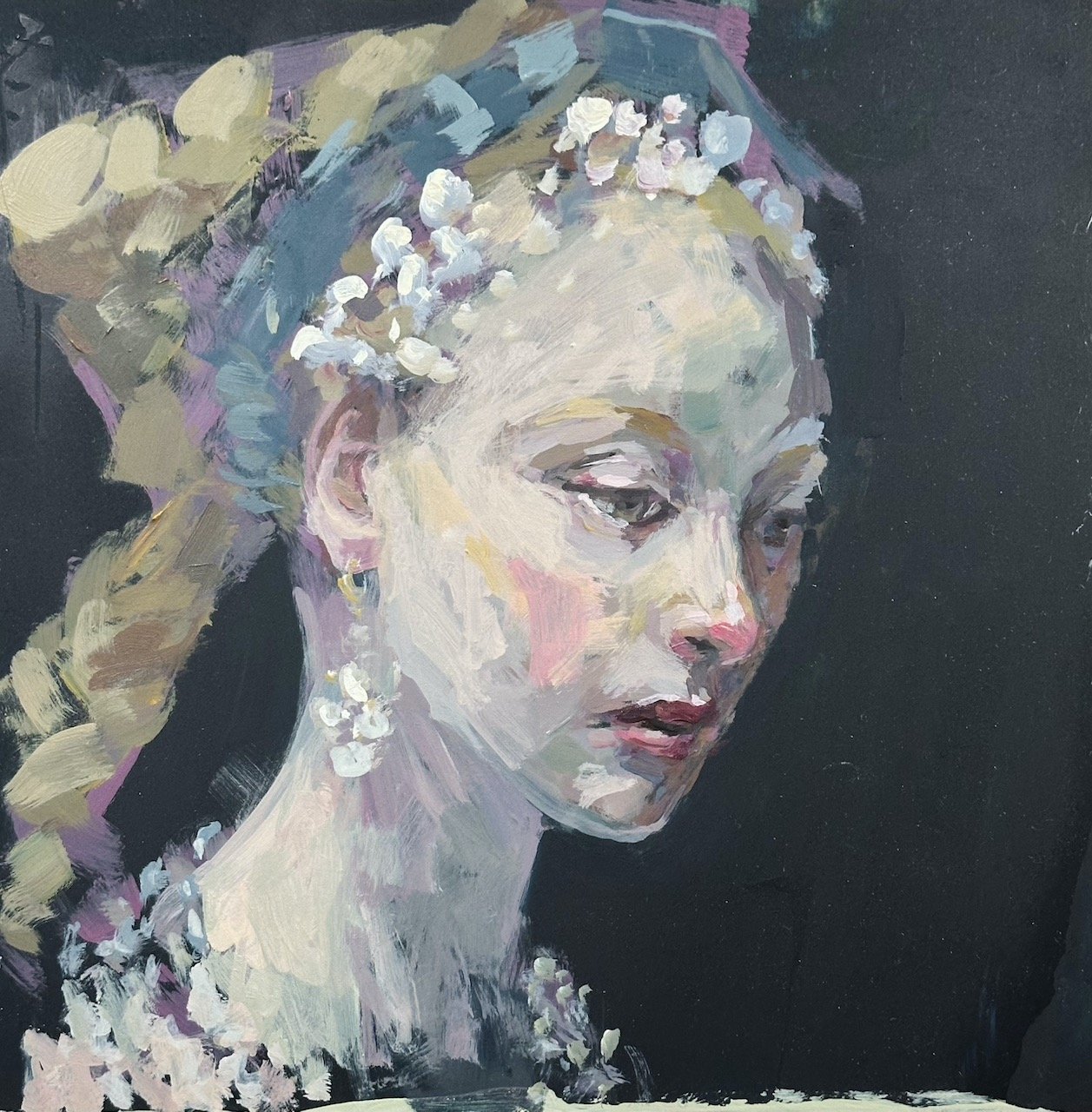
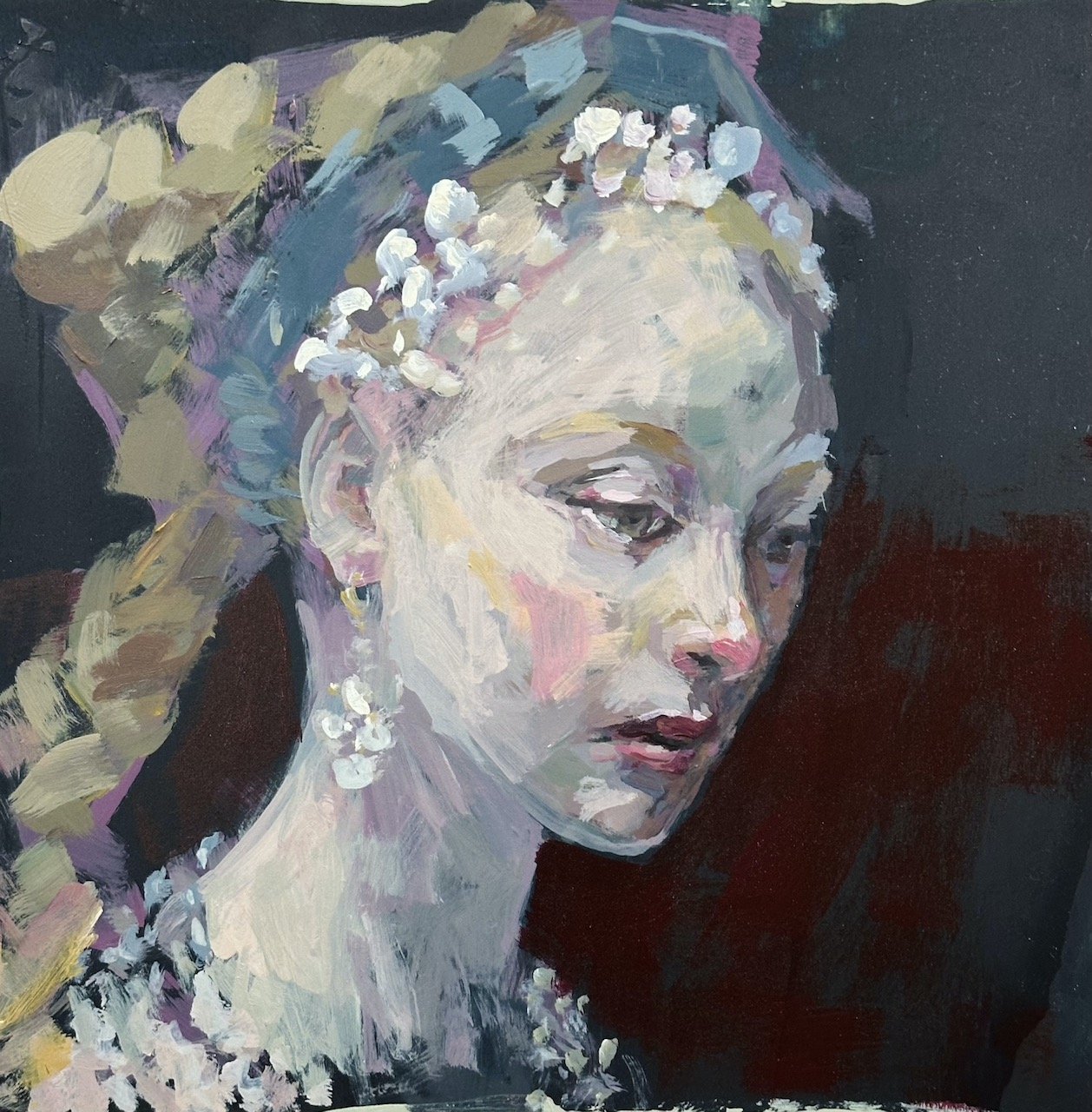
…so now it’s a matter of refining the face and touching up the background again and I second I’ll be done.
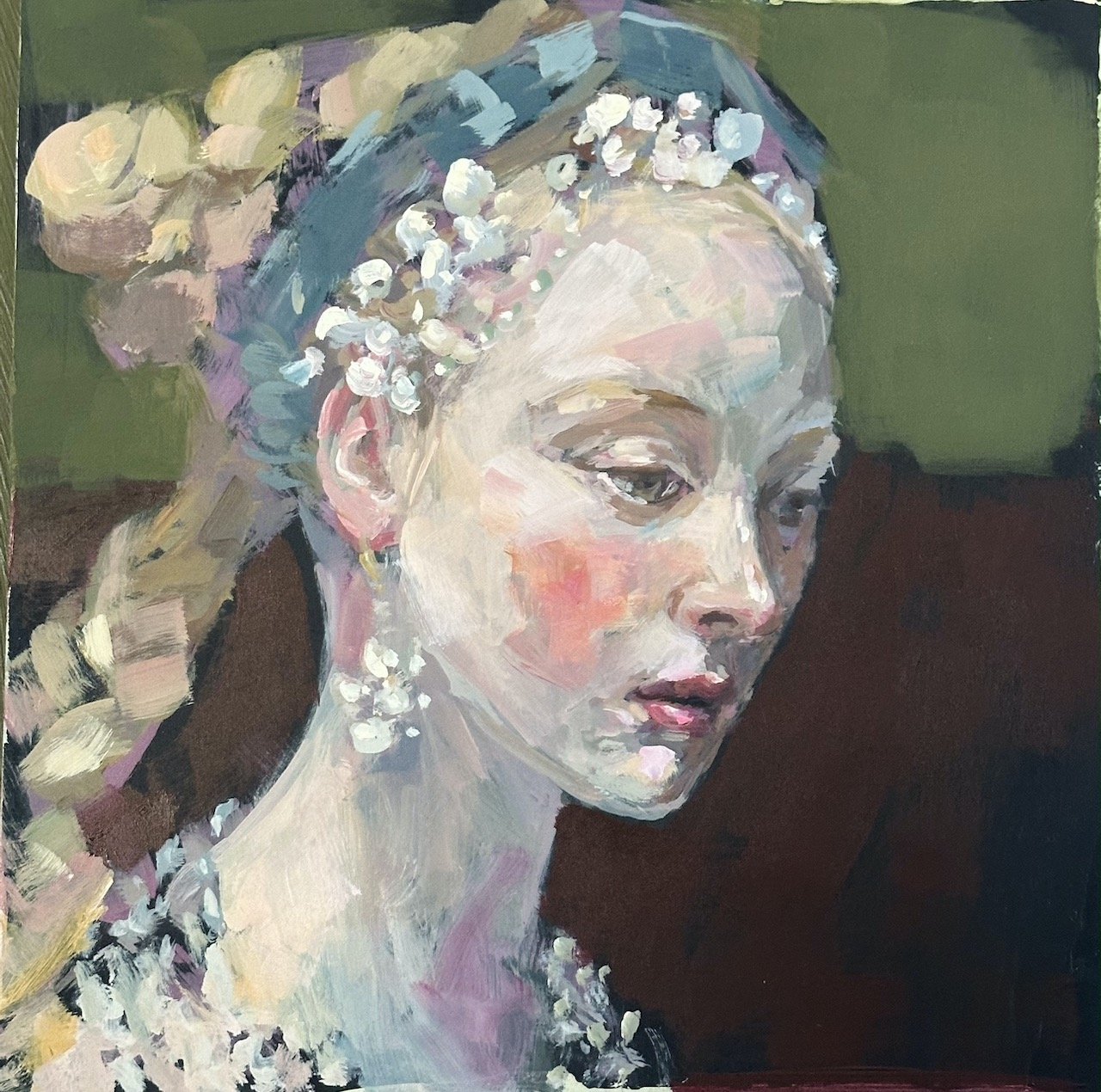
Finally, I photograph the finished work in filtered daylight on both my iPhone and my Nikon using a macro lens. The images appear so different, and as usual, I can’t decide which one is better so I’ll pop them both here and let you decide.
The end.