I thought it would be fun to run a short course painting facial features with oils. By just focusing on single features at a time in each lesson, without the pressure of painting a whole face, we could concentrate more on skin colours, paint application, subtle shifts in tone and temperature, and alla prima painting techniques.
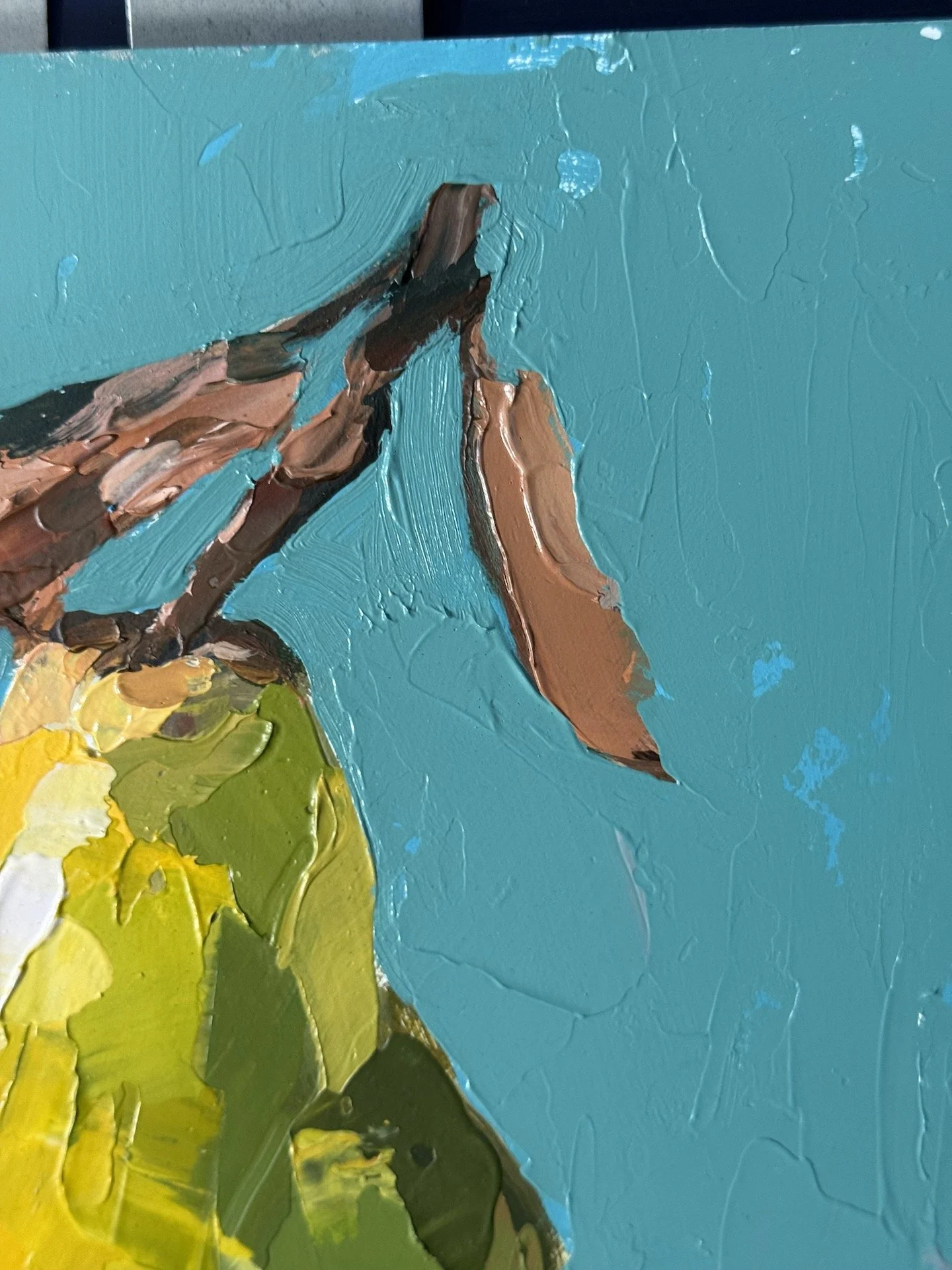
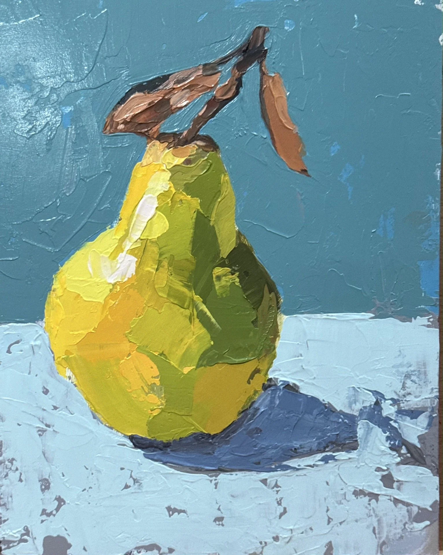
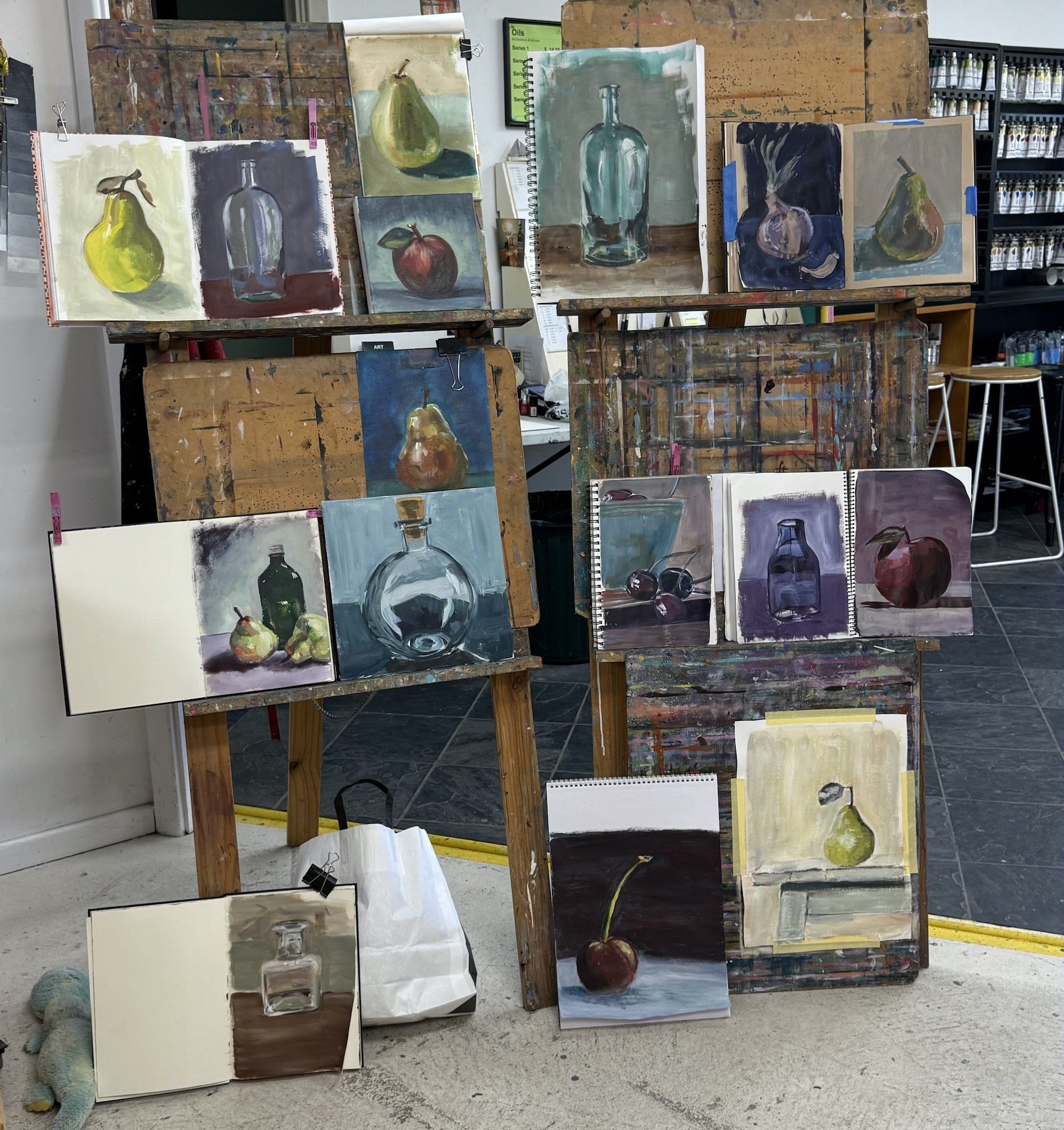
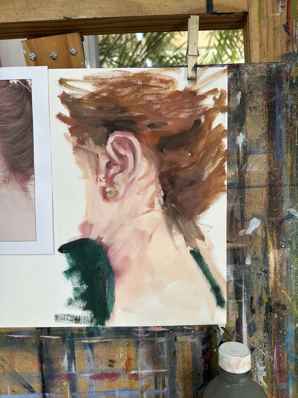
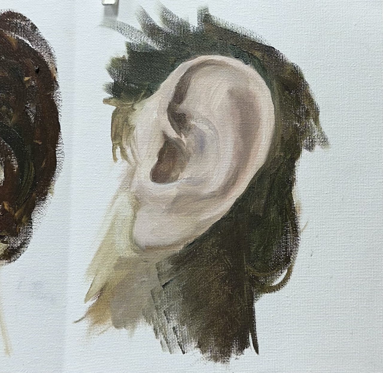
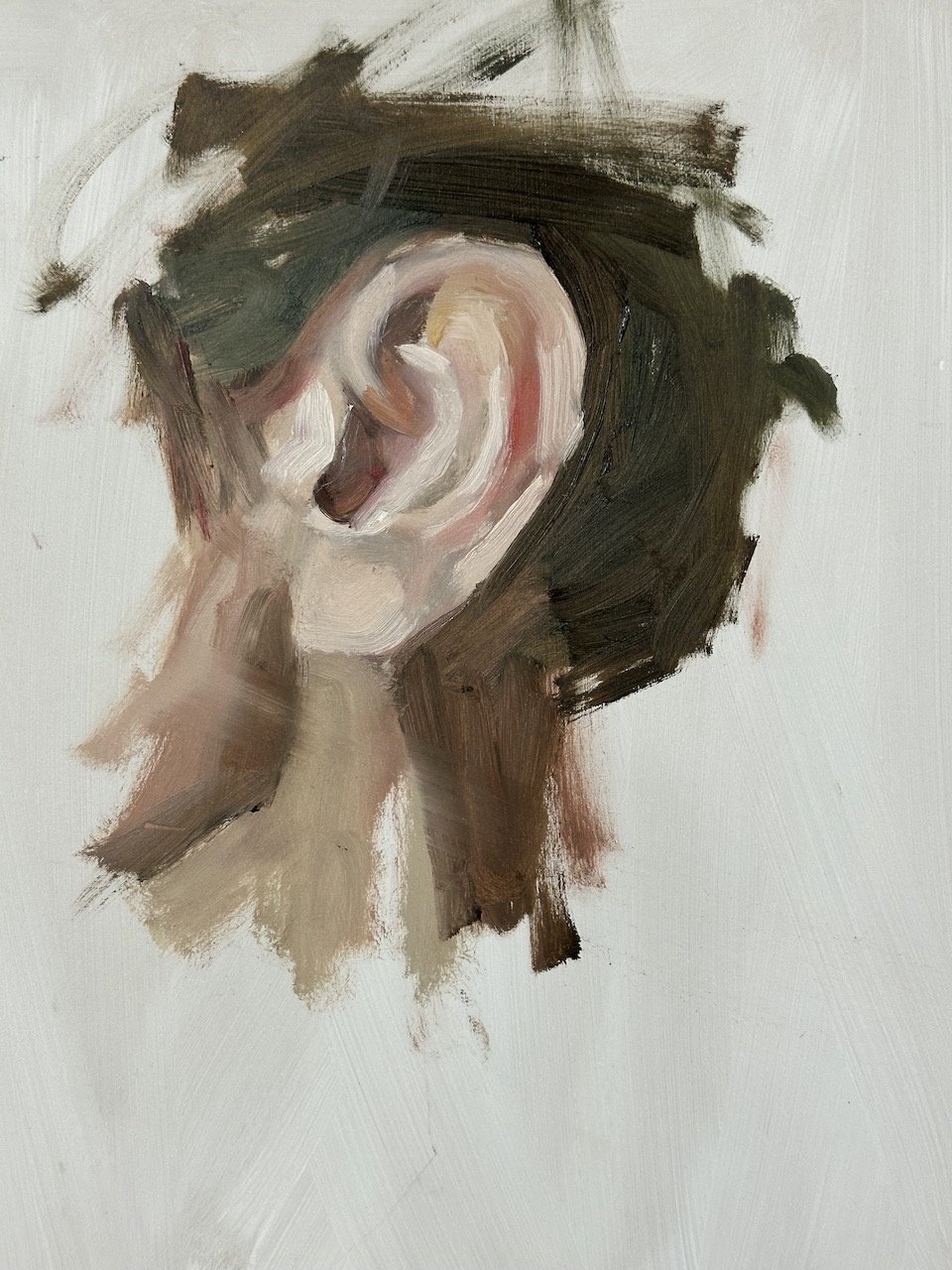
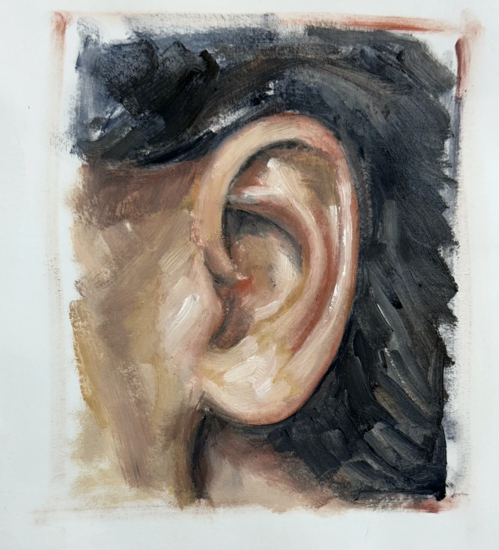
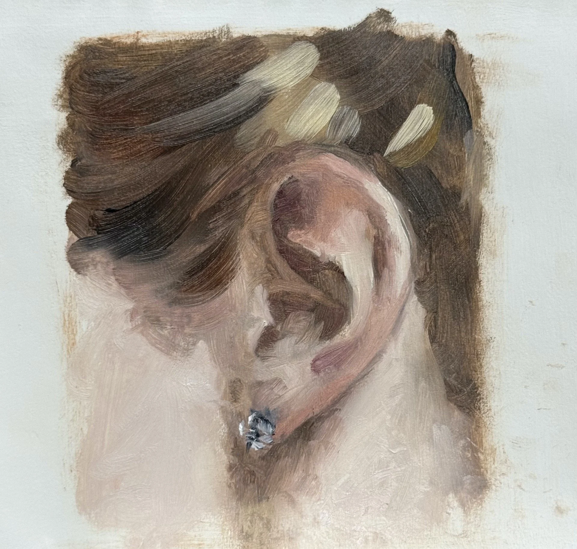
In preparation for the first lesson I started with an ear study in my journal. It was good to get my oils out and give them a dust off, (I’ve been painting with only acrylics for the past few months), so I planned the process for the first session.
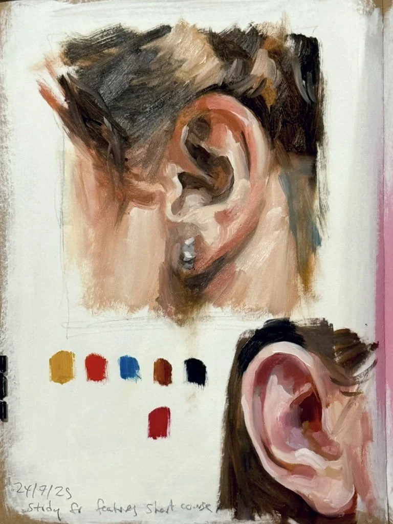
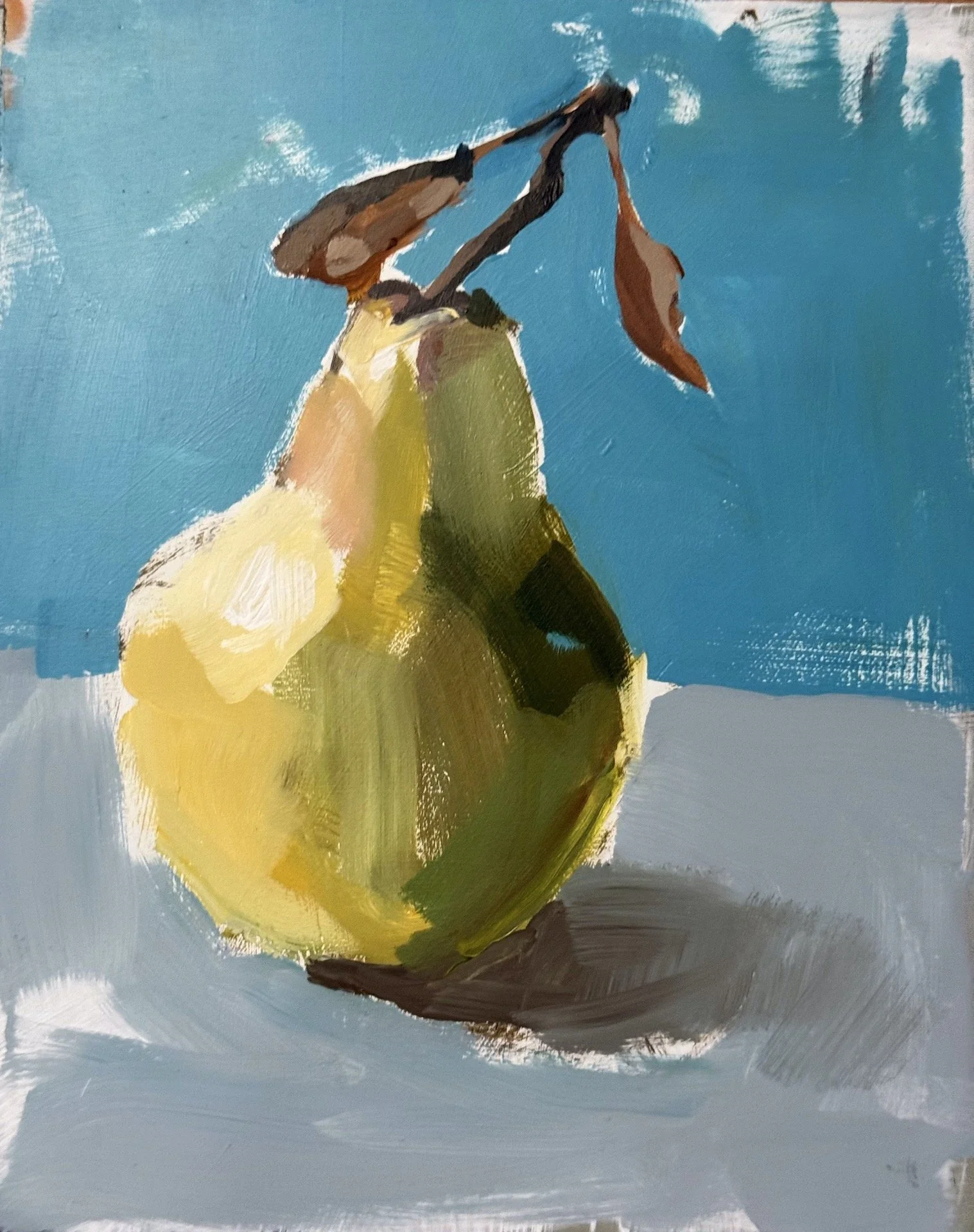
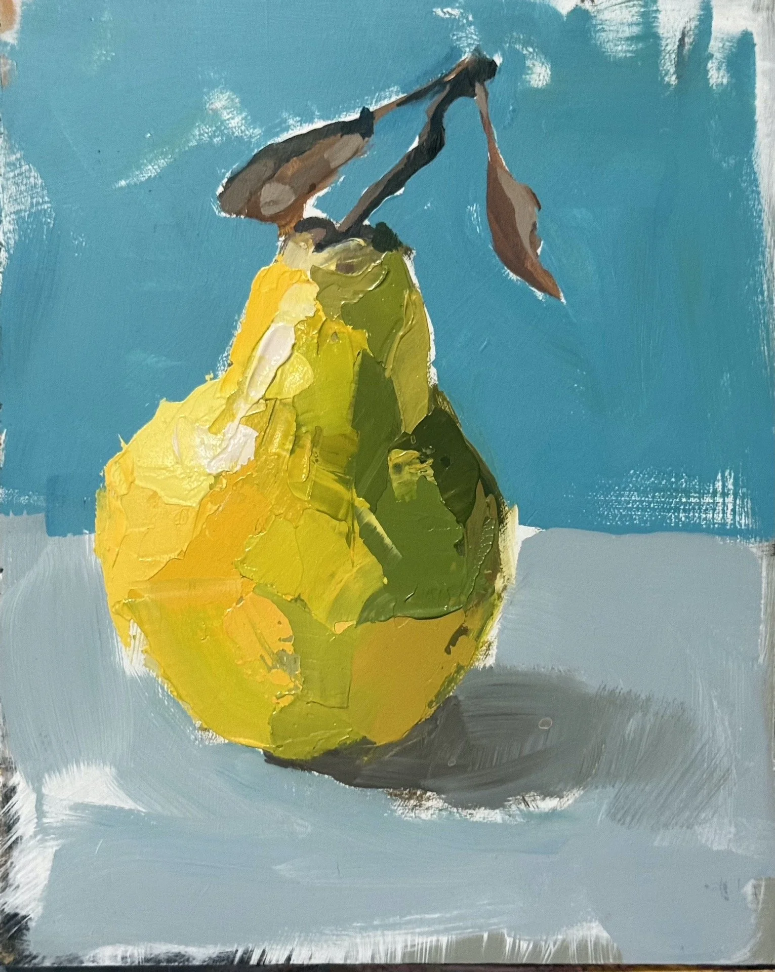
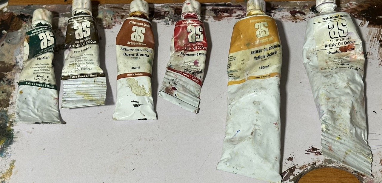
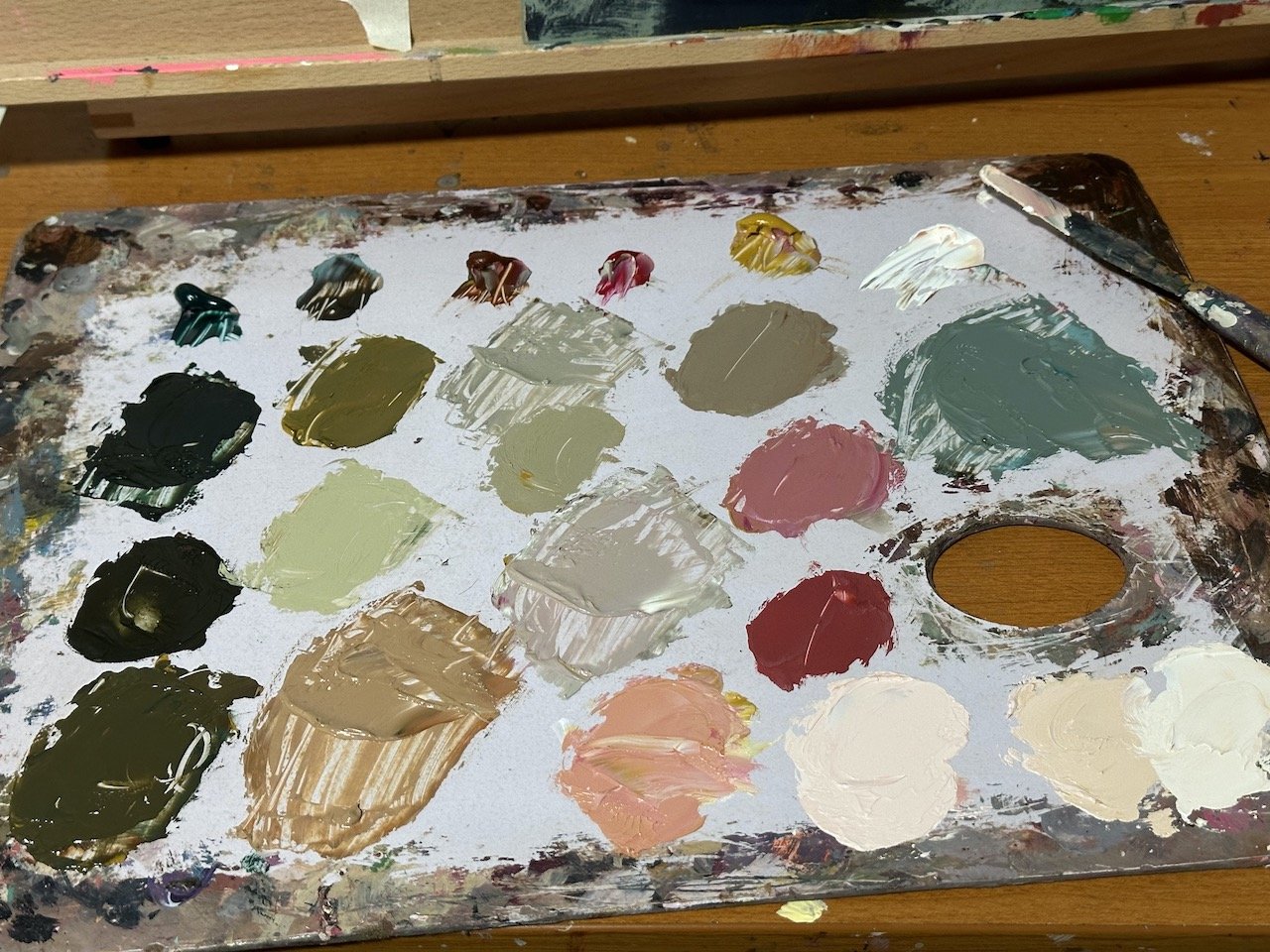
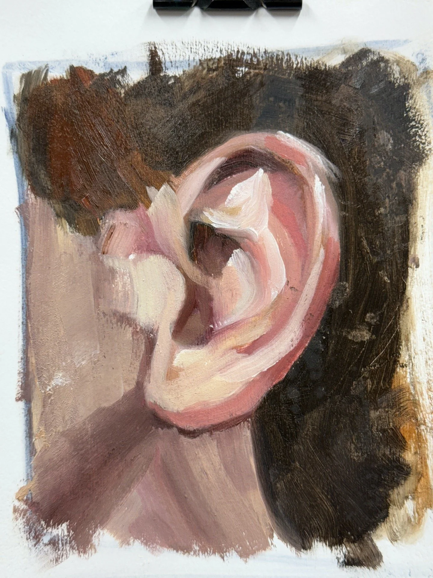
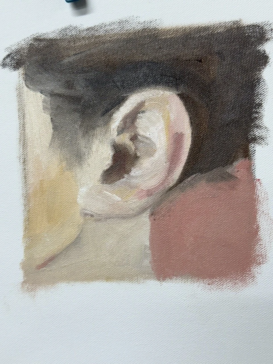
Noticing my pallet choice - I like to choose a few different reds and stick to only yellow ochre for my yellow. Cerulean blue is the easiest blue to use for skin, methinks, and some kind of black when some additional dark is needed later in the painting process. Note the difference the addition of permanent rose red makes to the bottom ear on the left.
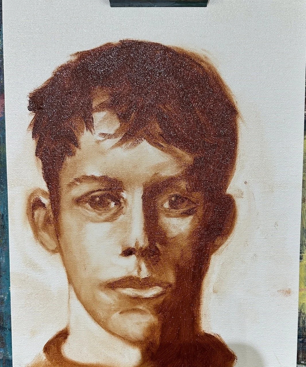
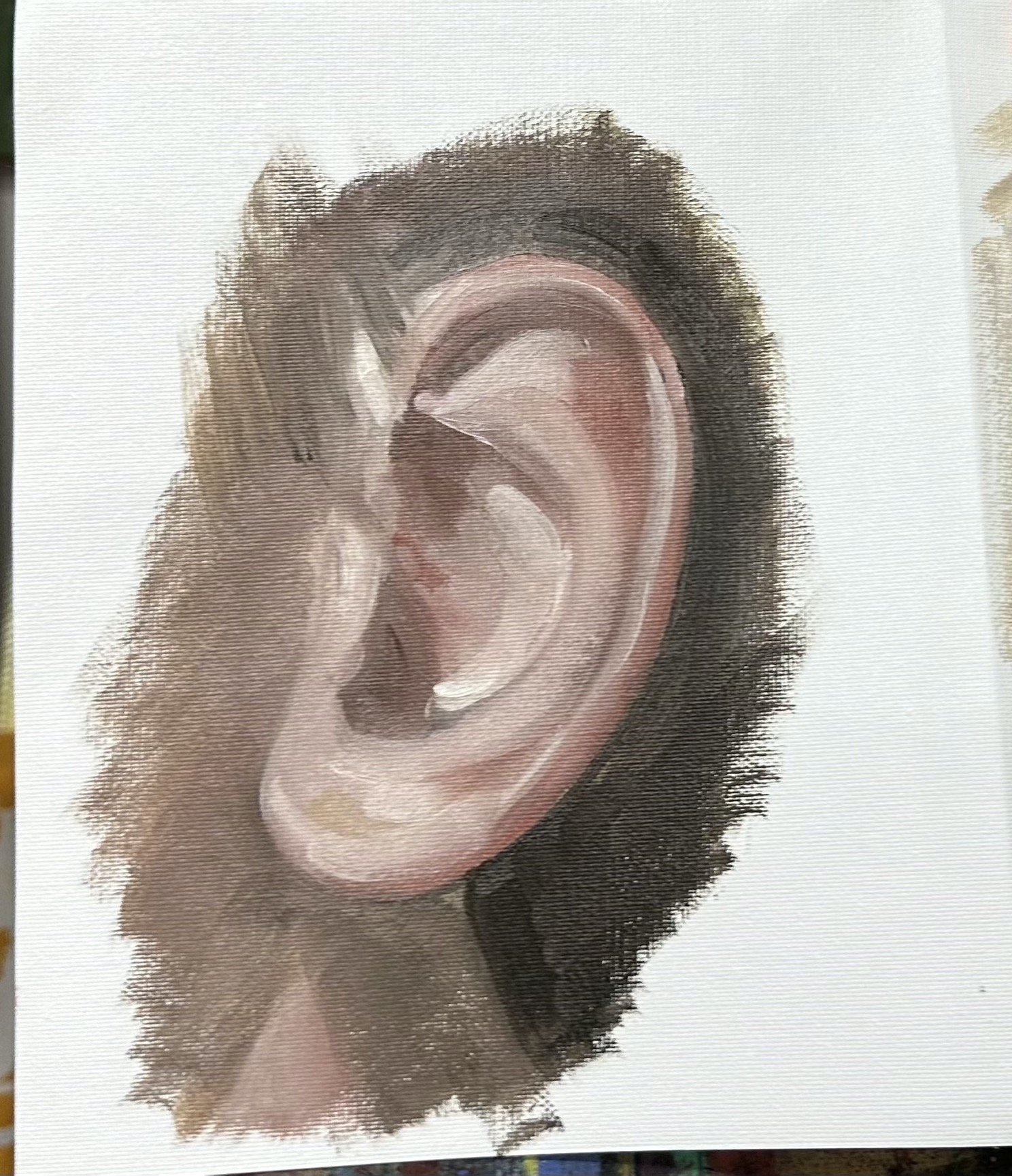
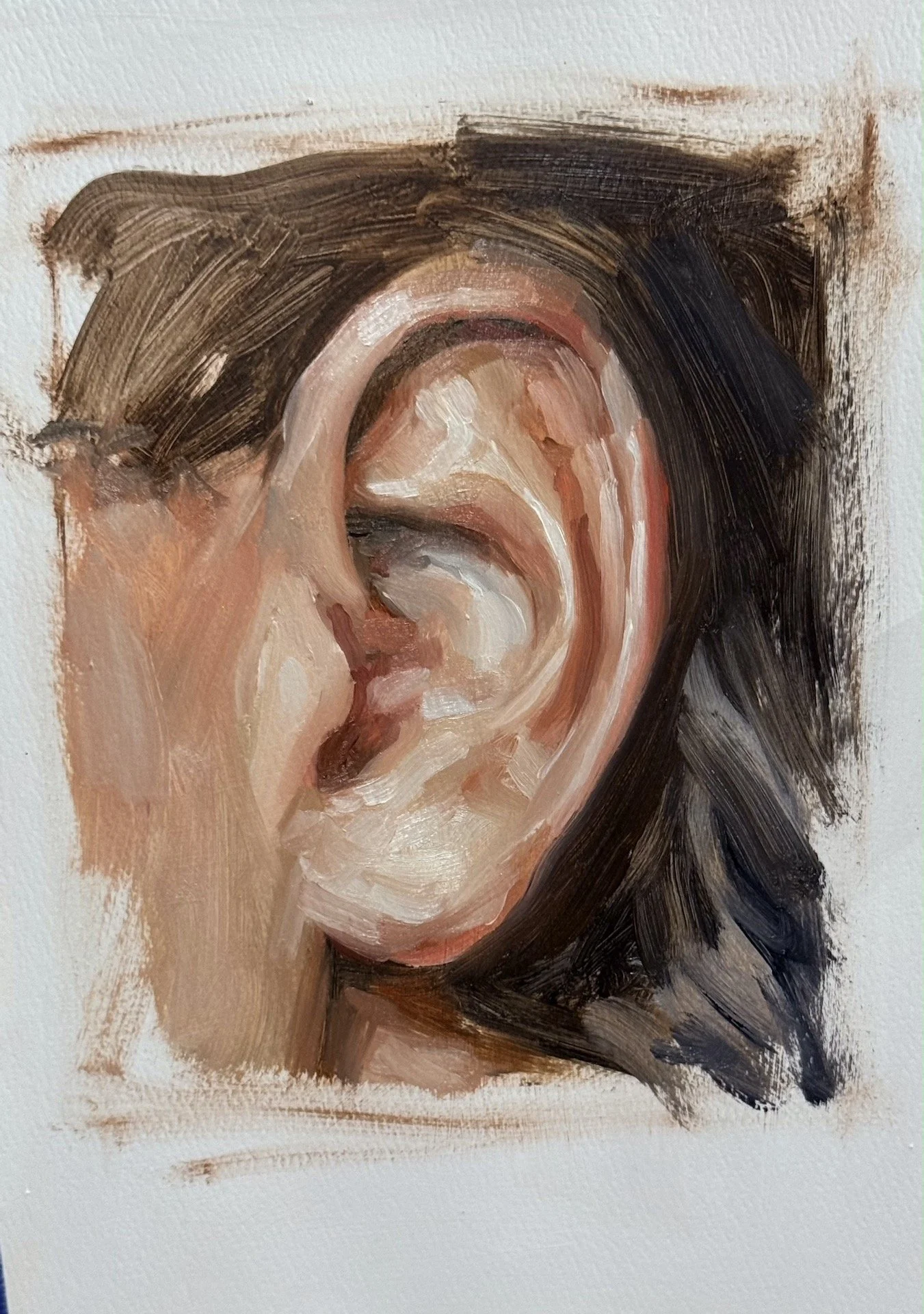
I find painting with a dry application the most satisfying way to paint alla prima, meaning straight paint, no thinning it with anything, starting with a drag kind of drawing and then painting into that, wet paint into wet paint, without using mediums to thin the paint.
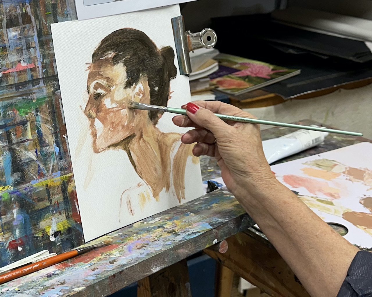
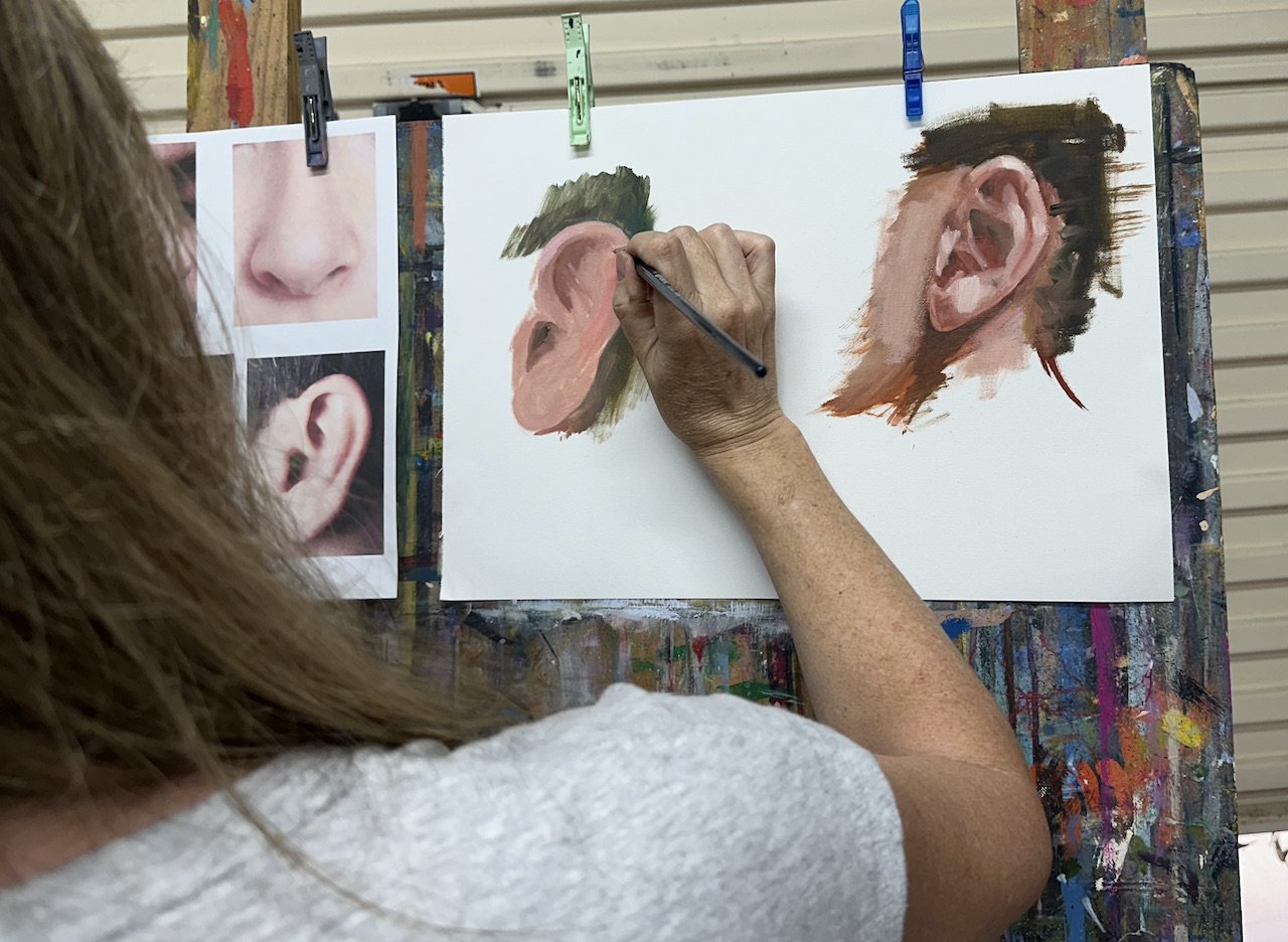
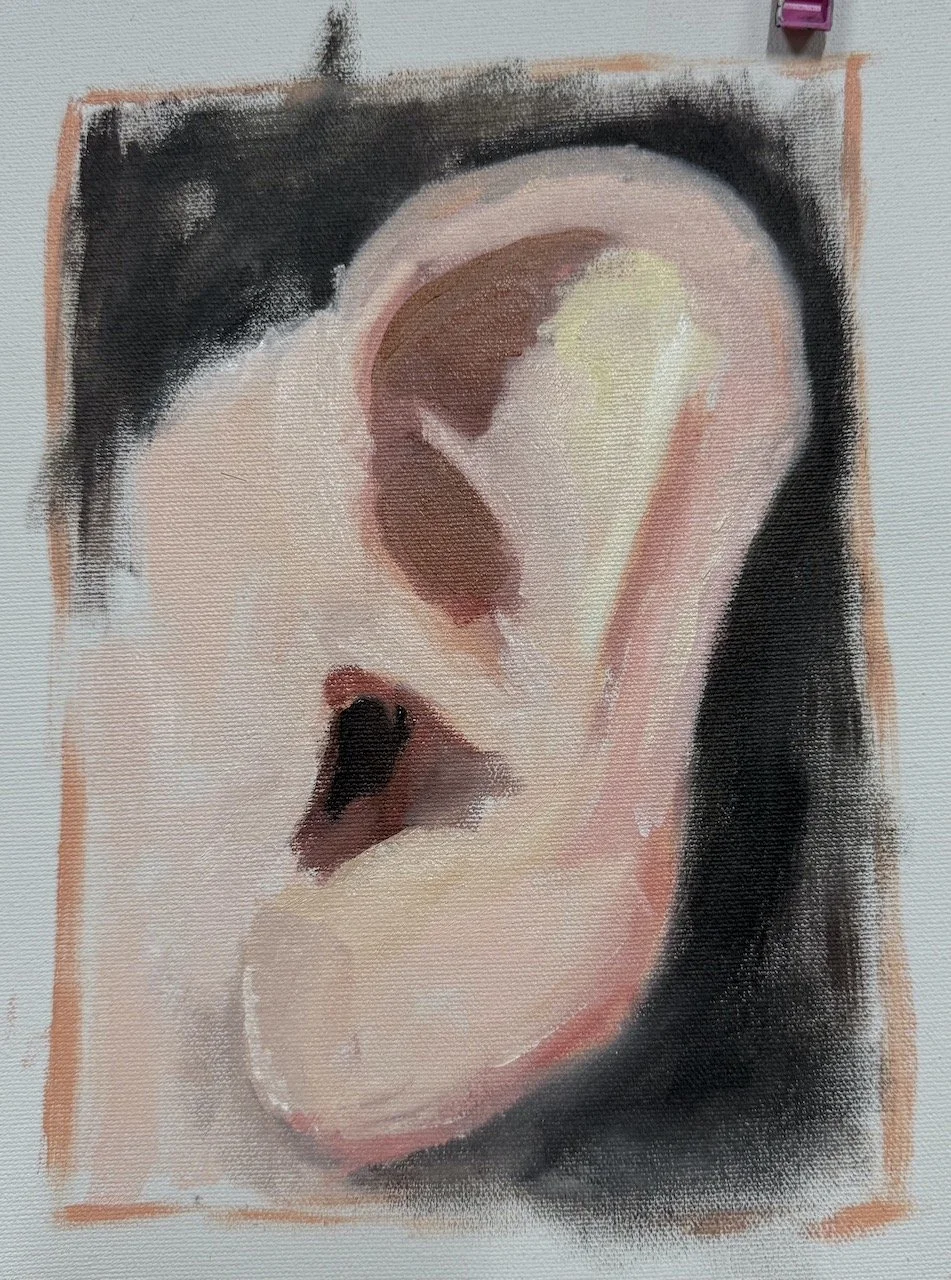
The first lesson begins with a demo using a dry painting technique, and I recorded the presentation - see below
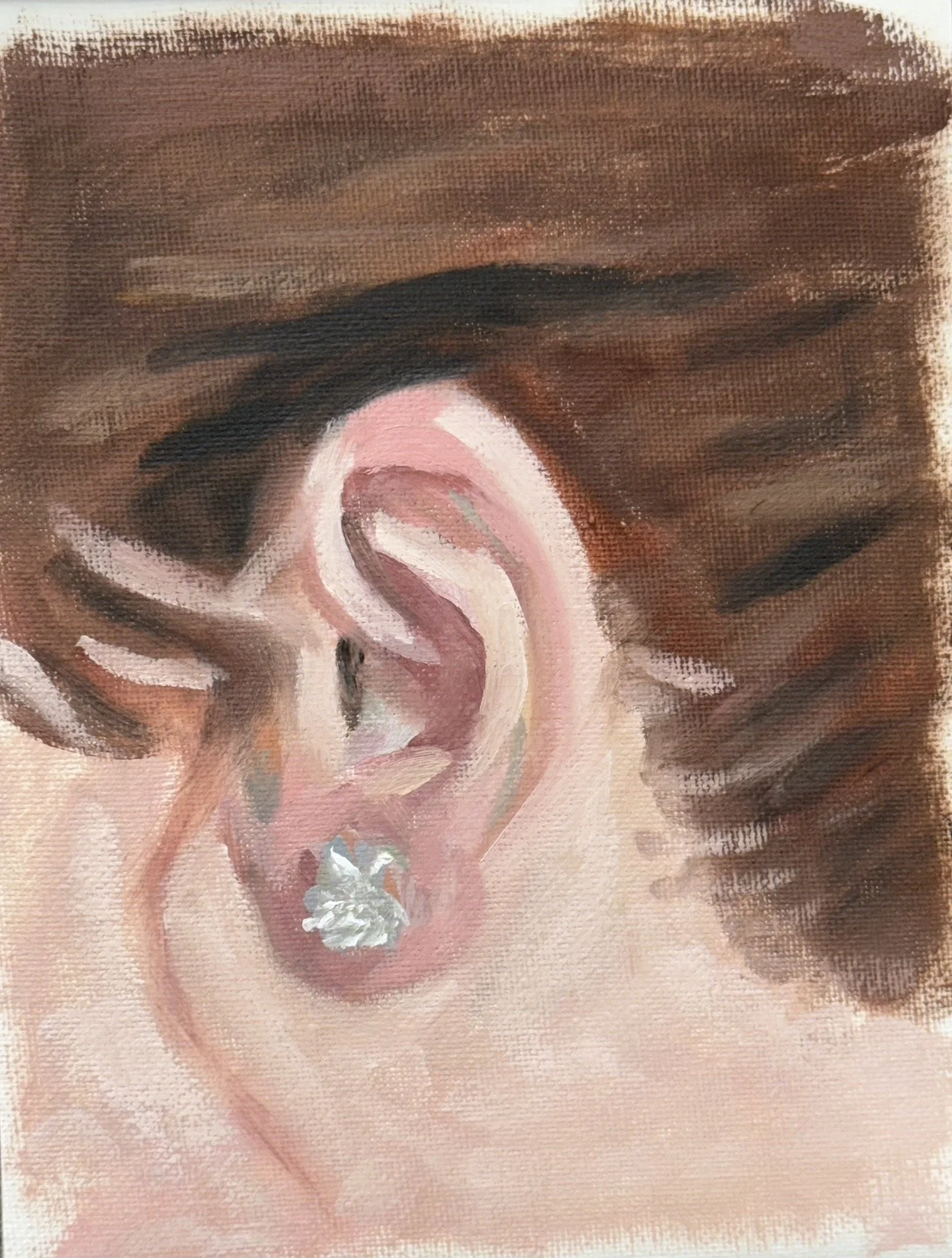
Participants had a go and I’ll post the work below. They did a great job. Oil painting takes a bit of getting use to, with the most difficult part being not moving the paint around too much once it’s laid down on the surface. It’s a natural inclination to want to spread the paint around and make it smooth on the surface. I want to see some deliberate brush strokes which means doing less moving of the paint once it’s put on the painting.
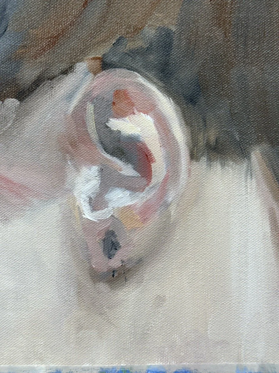
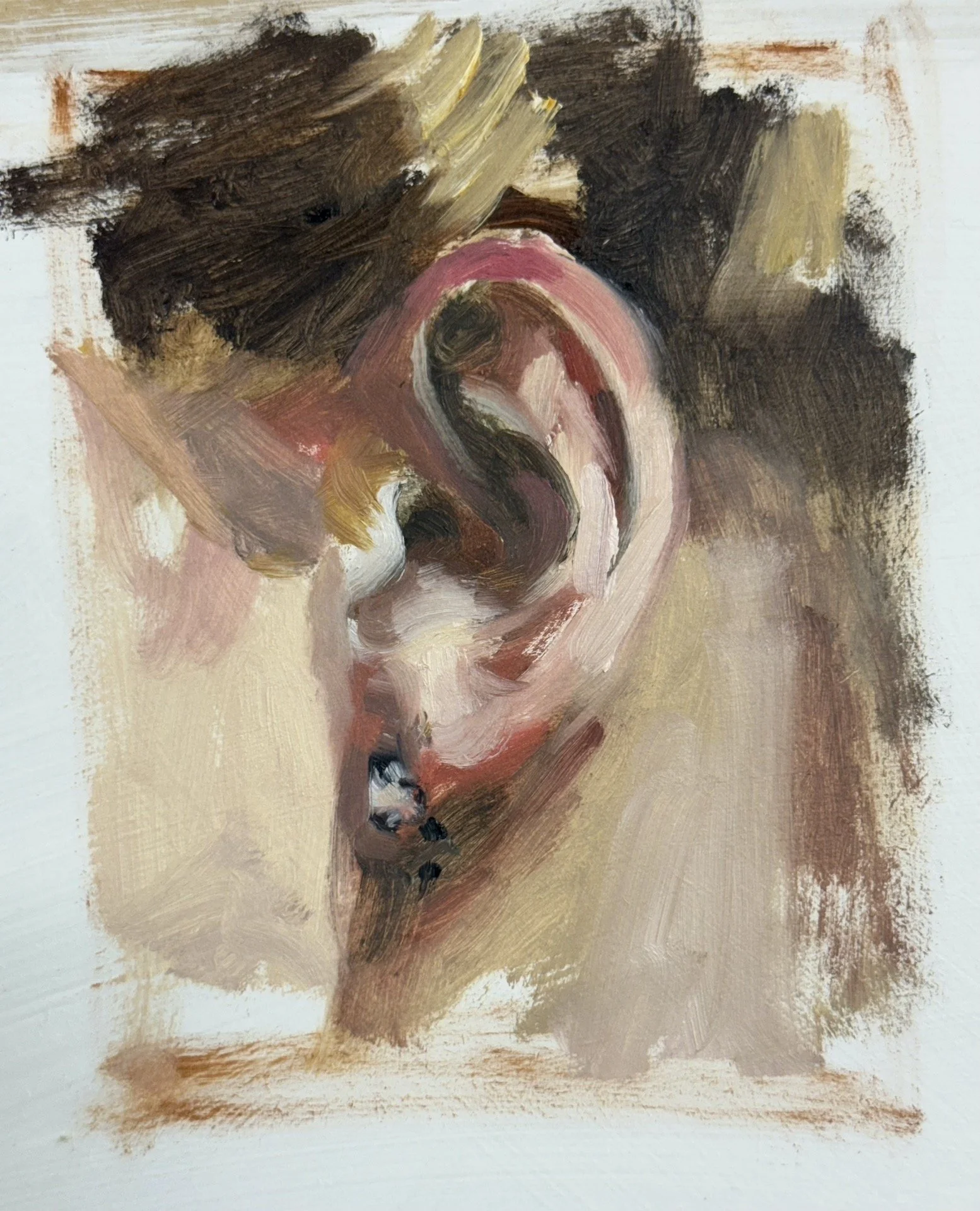
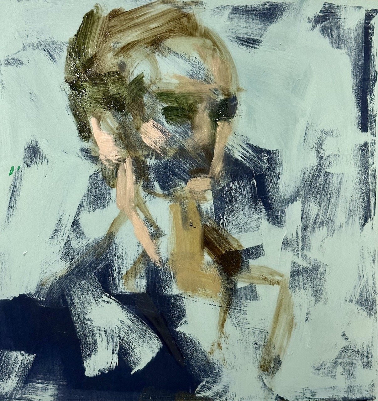
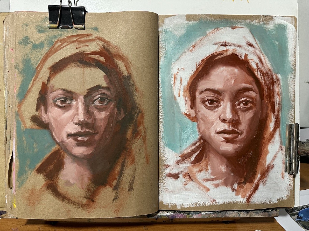
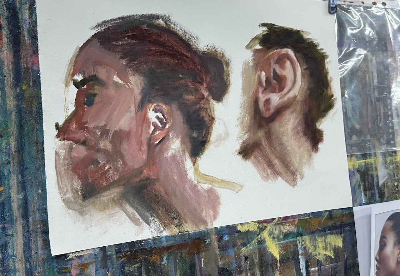
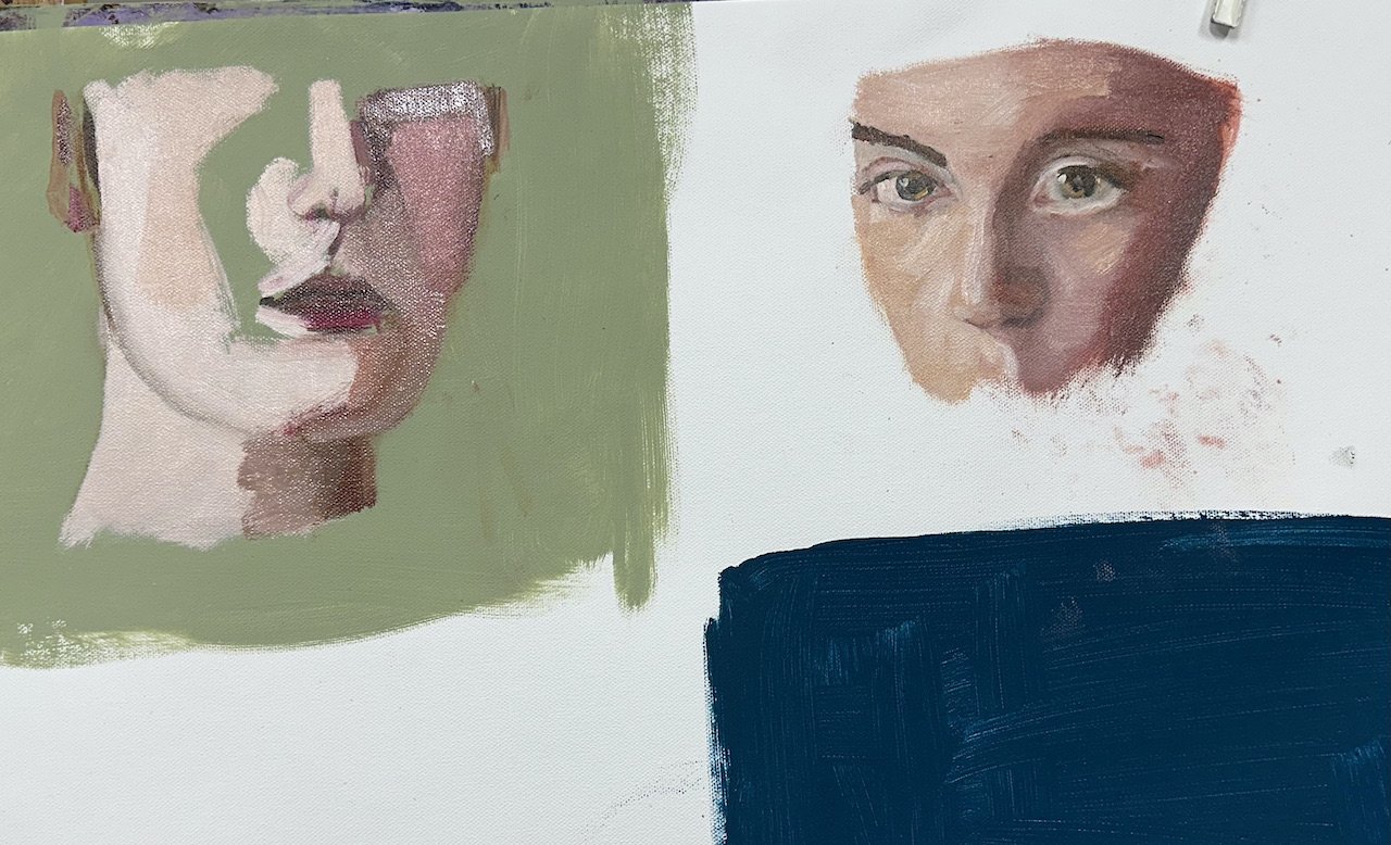
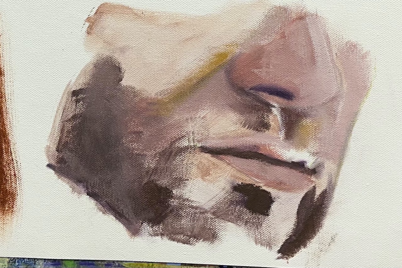
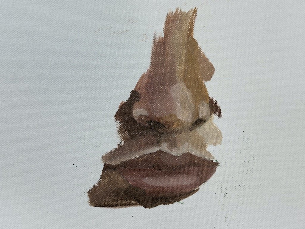
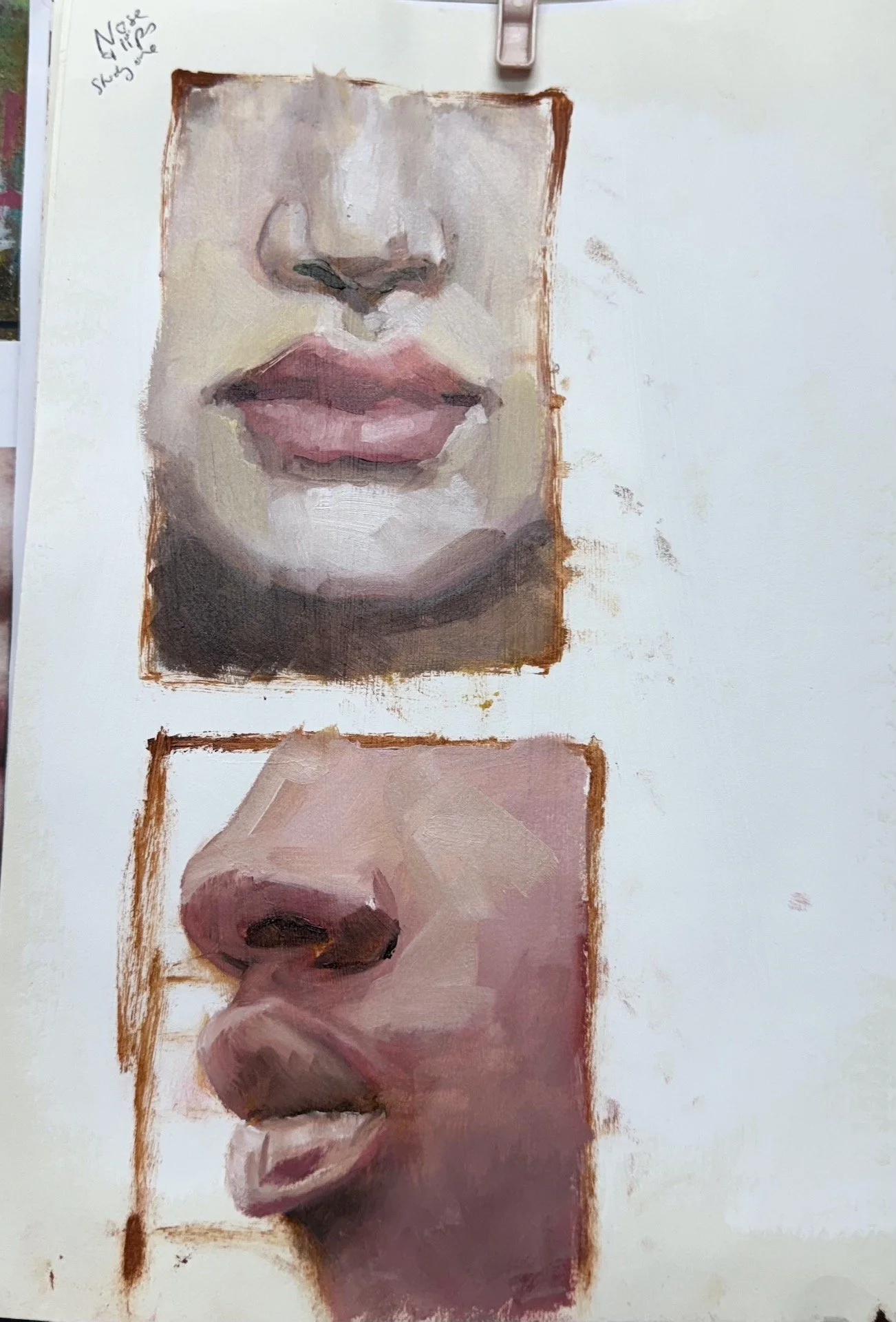
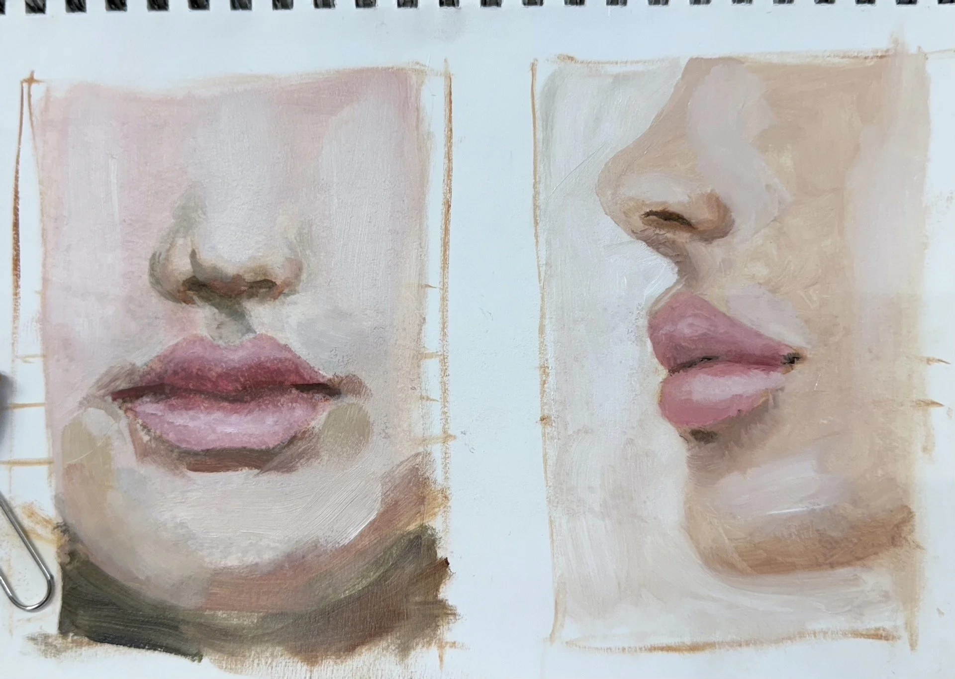
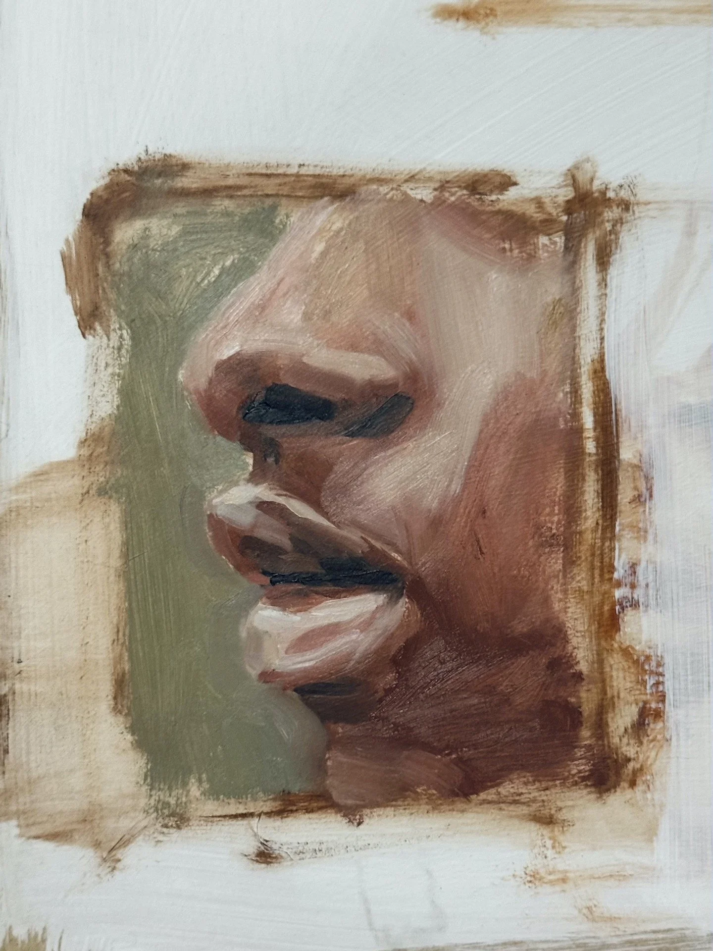
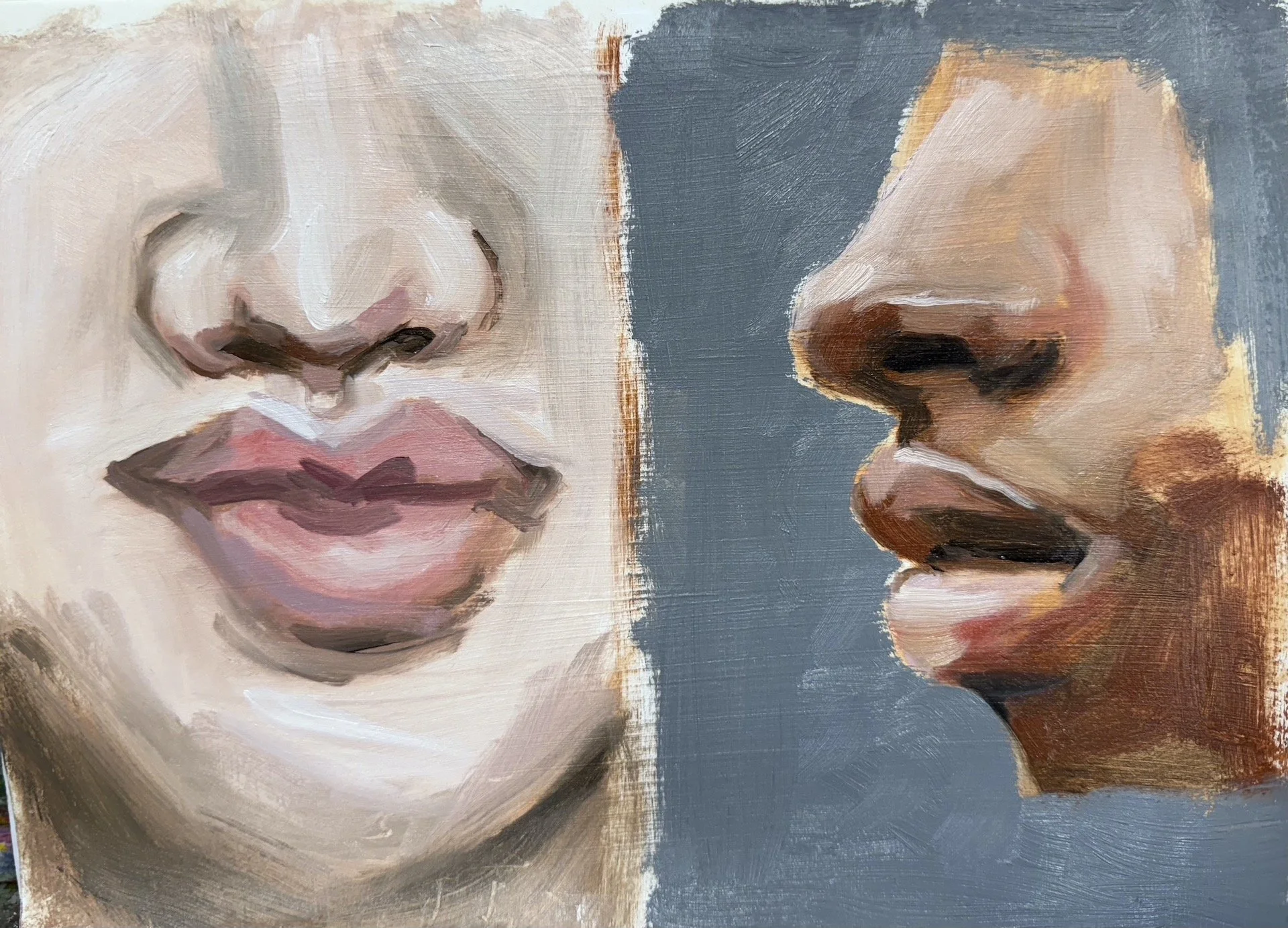
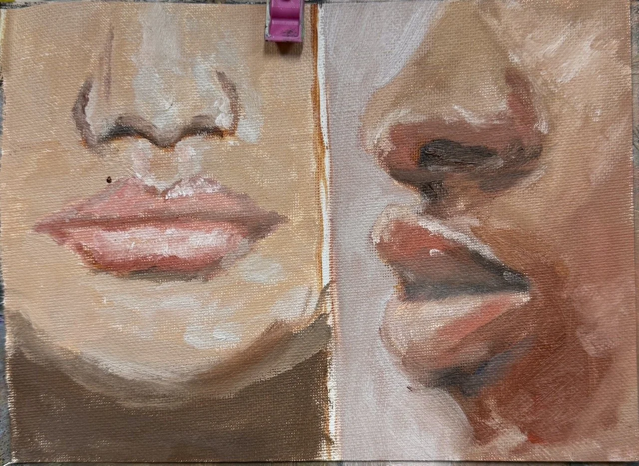
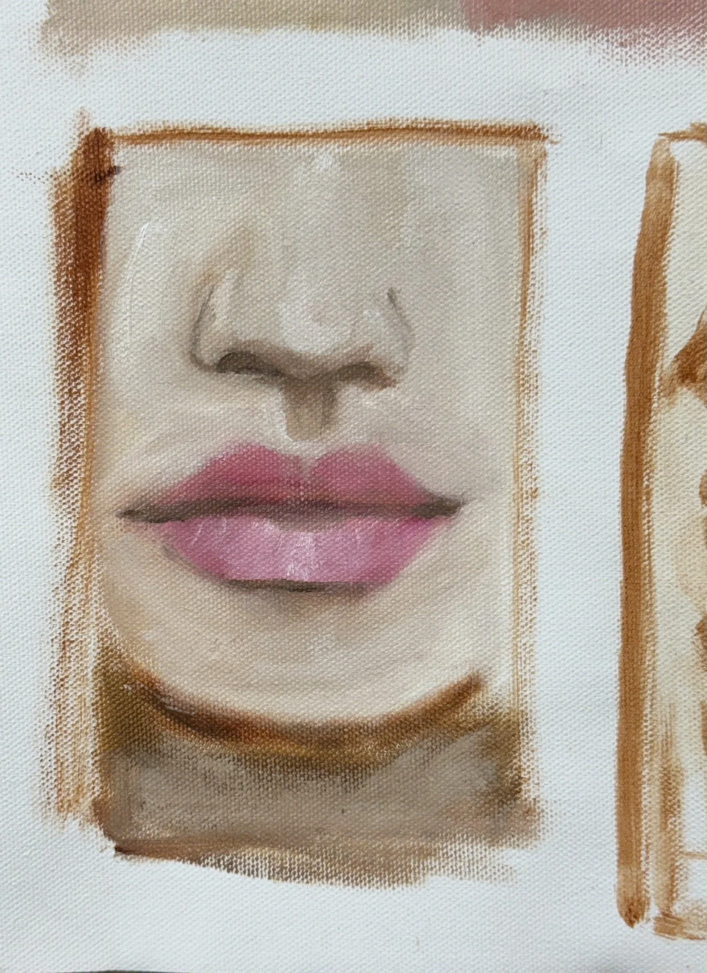
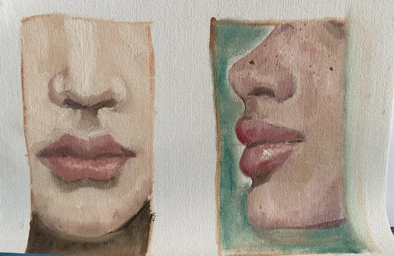
The second session we looked at noses and mouths. I think it’s a good idea to paint these features together, even in a study, because of the part of the face in-between the nose and mouth, joining these features when painting helps them to sit naturally in the face.
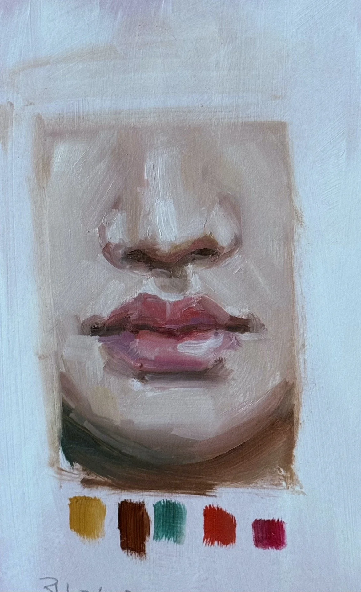
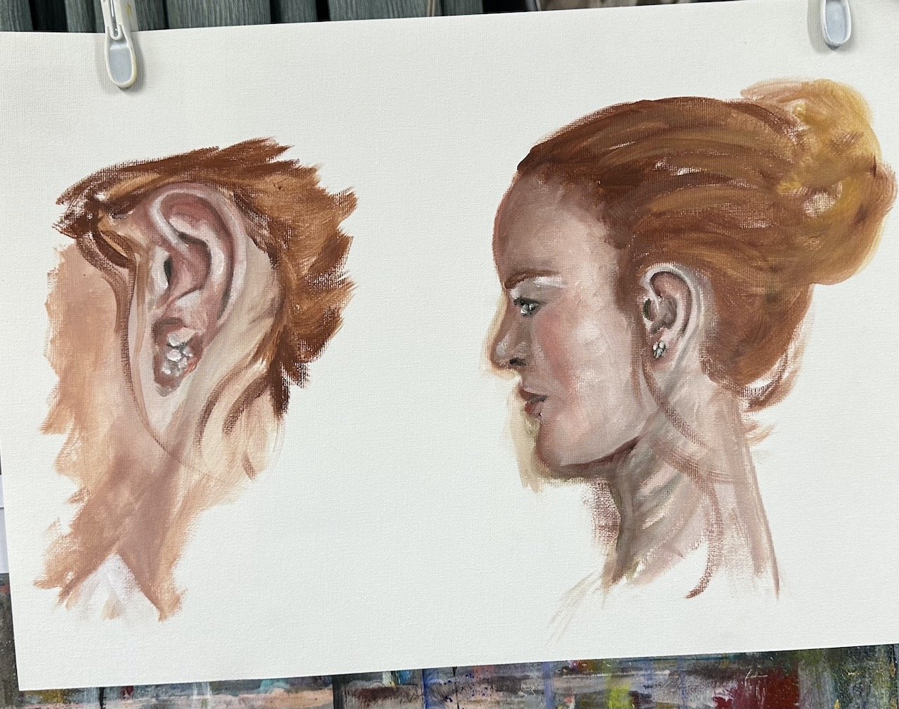
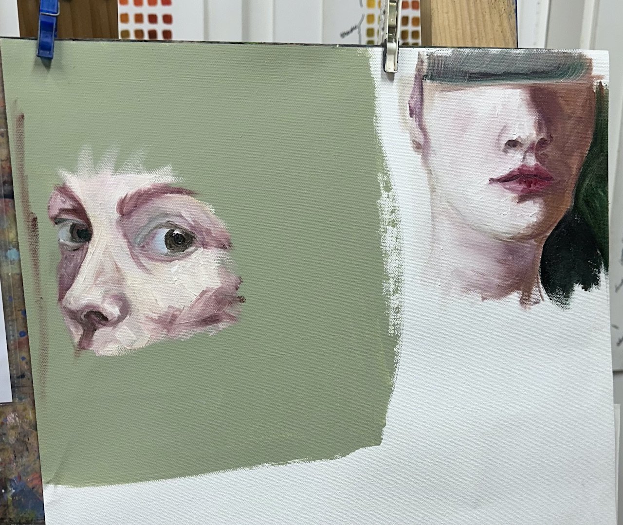
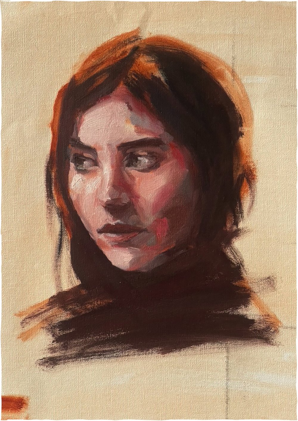
my study
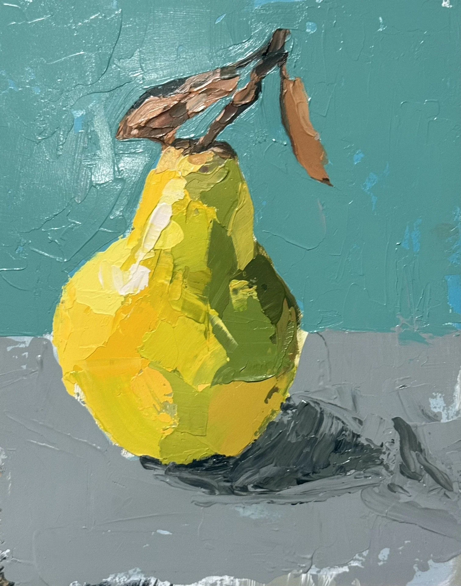
for this study I swapped the blue and the black for viridian green because the tones are so much more subtle in this area.
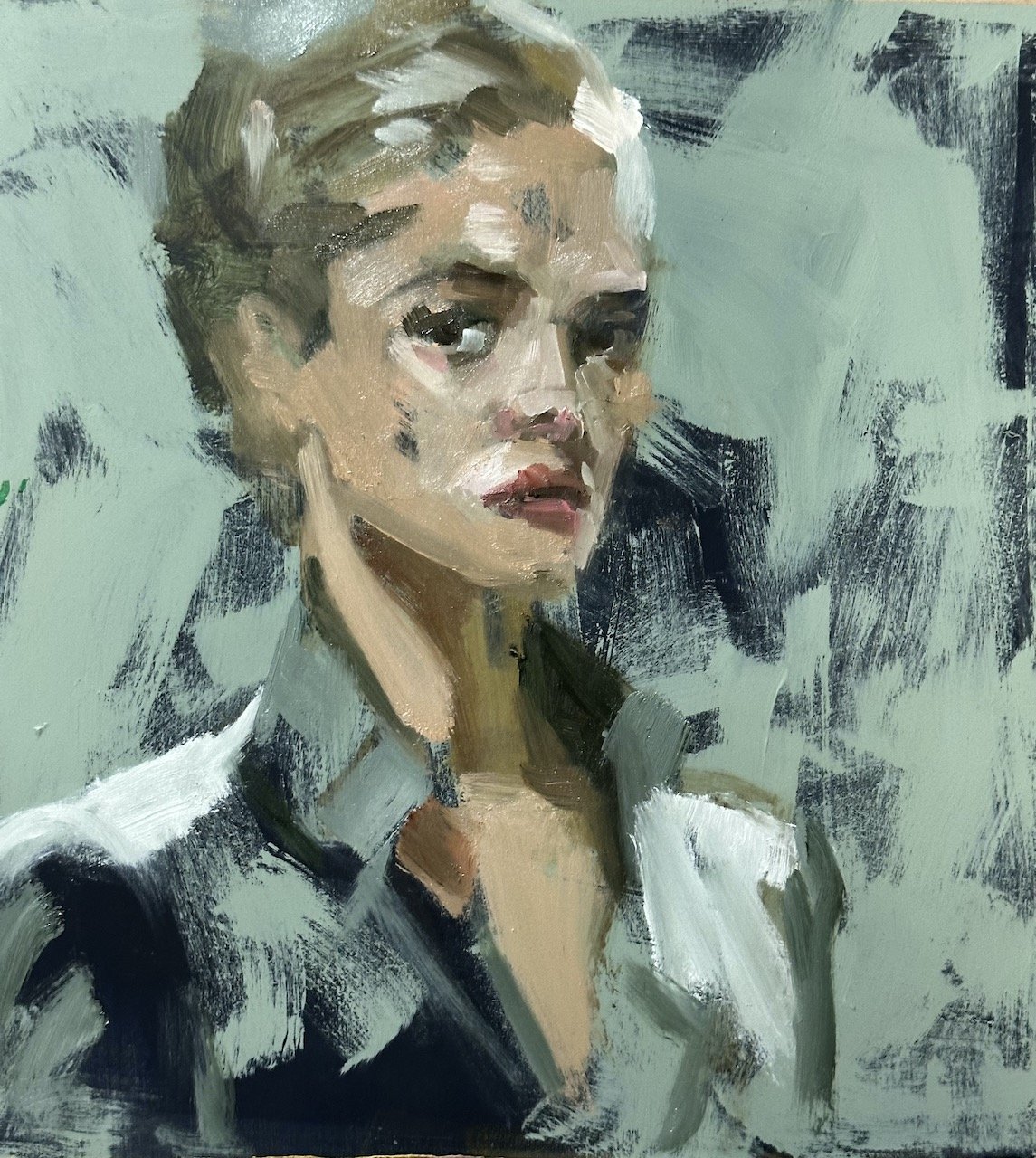
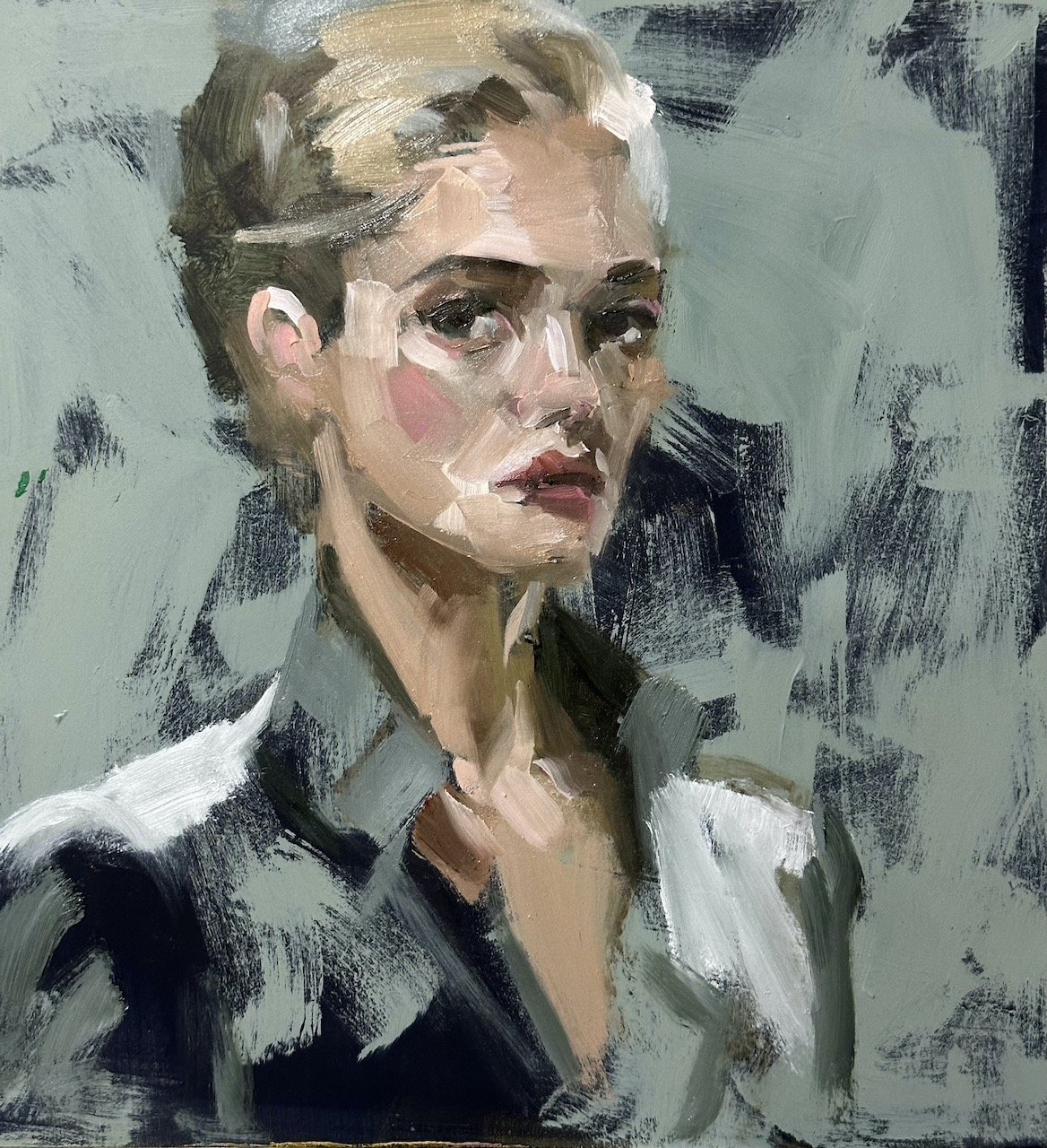
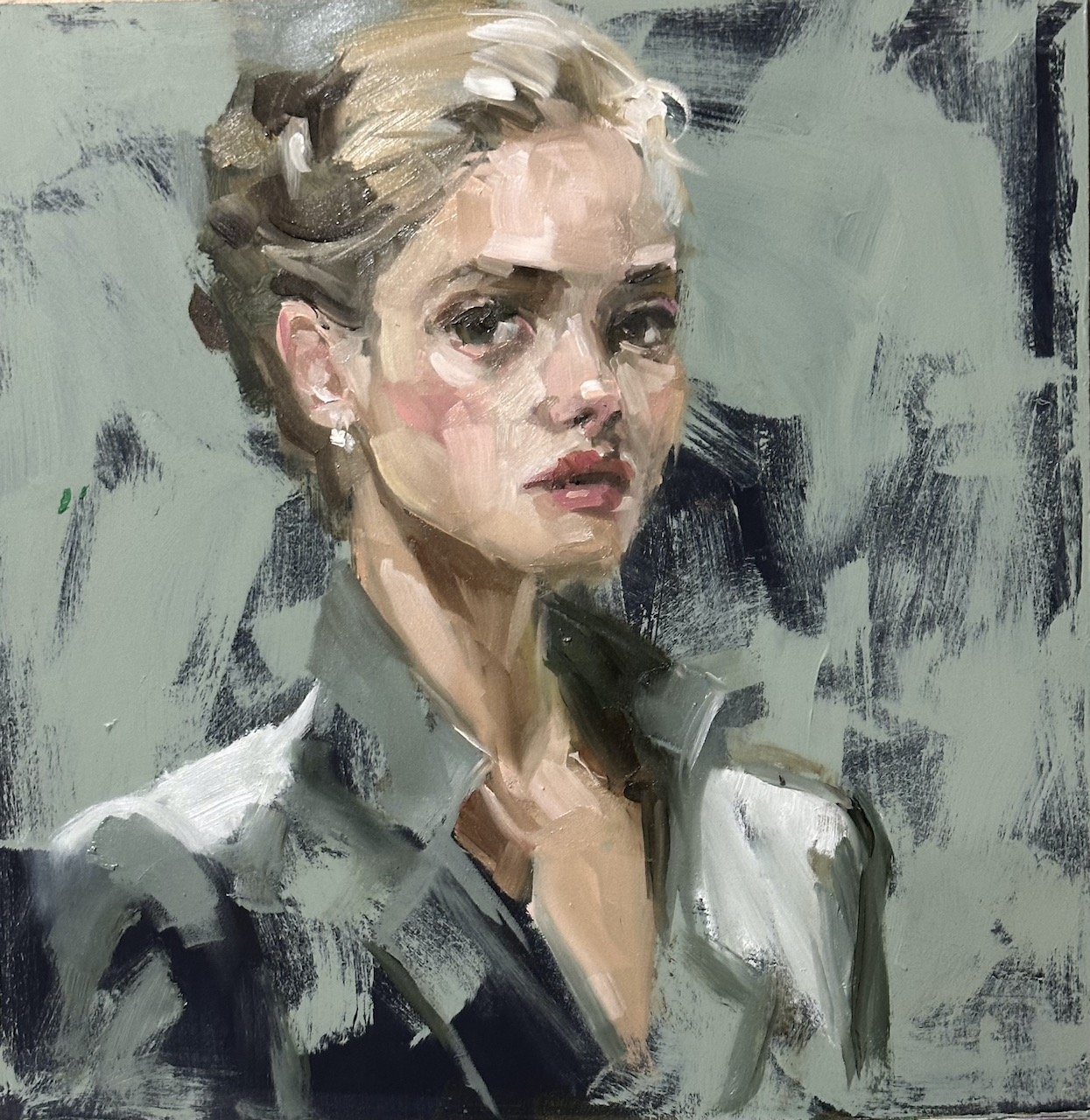
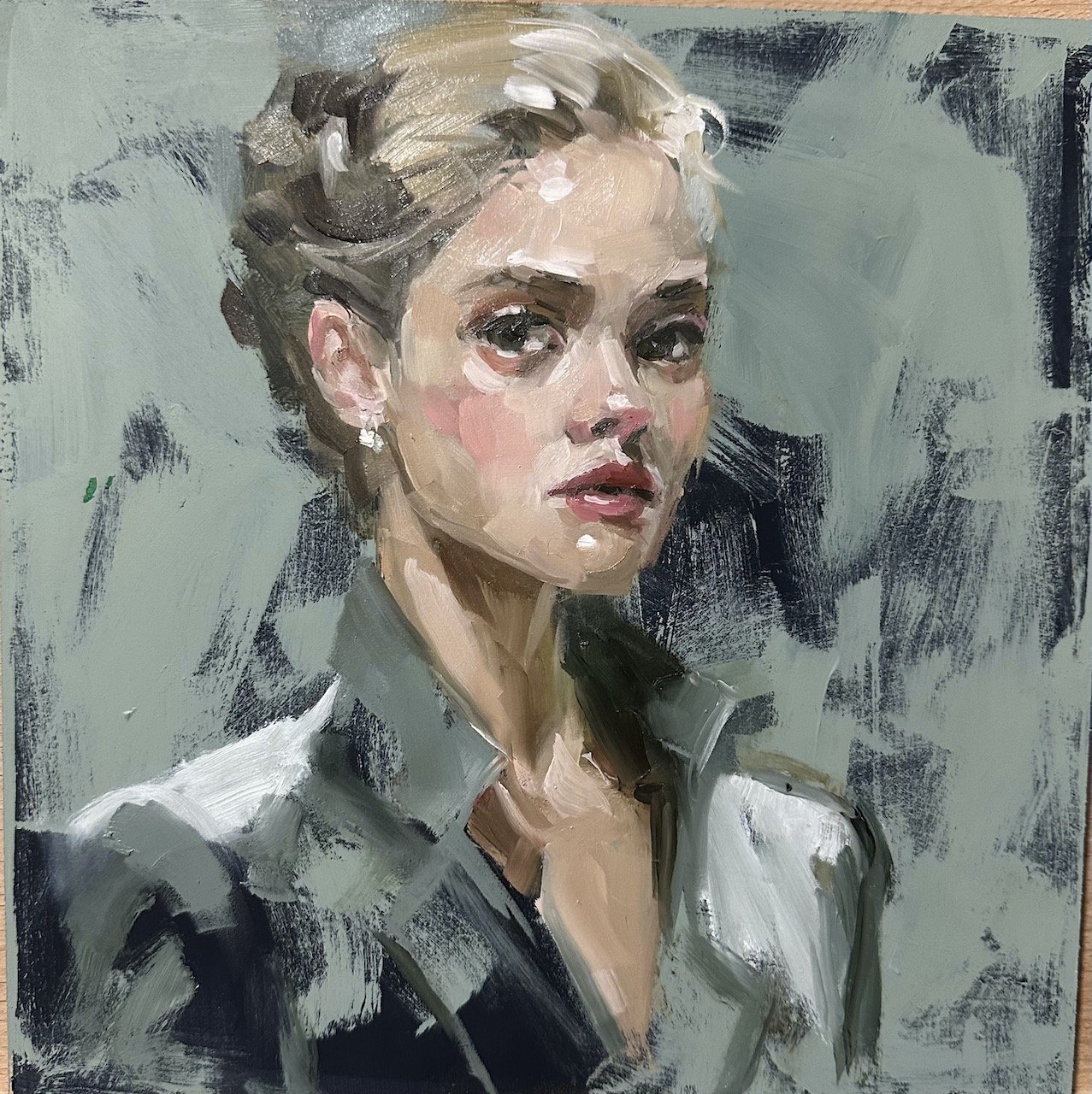
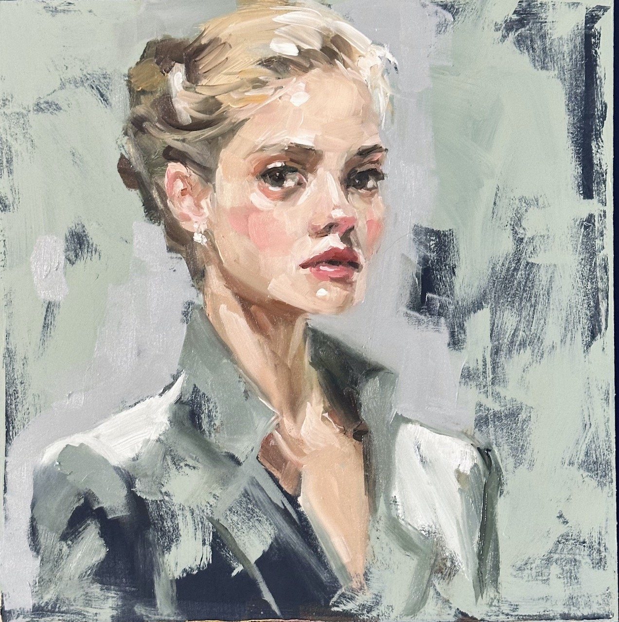
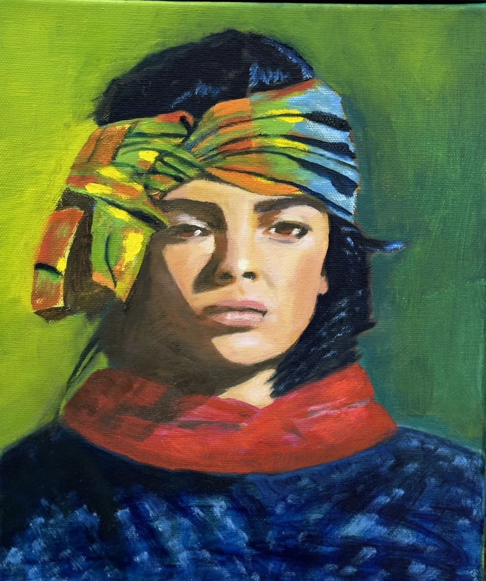
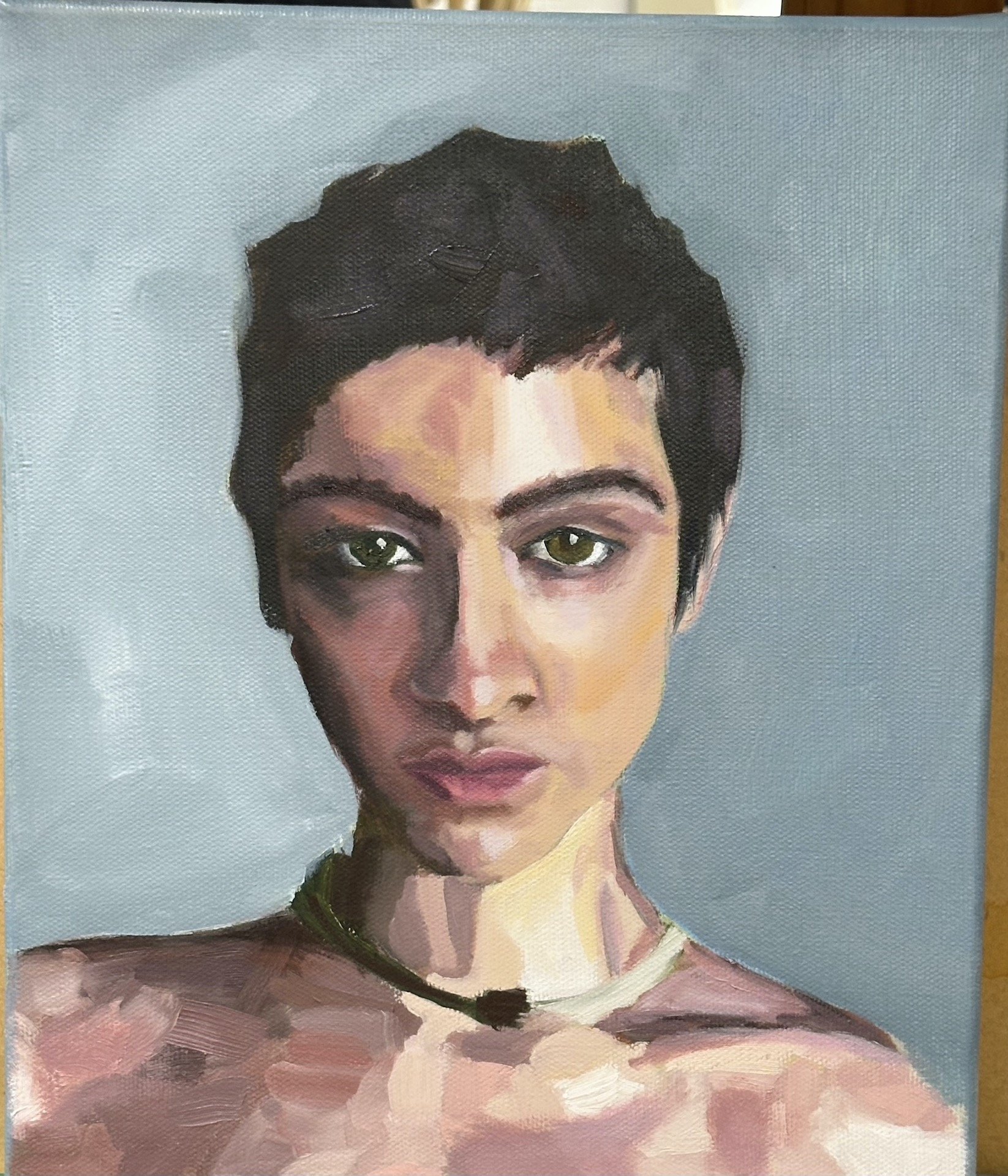
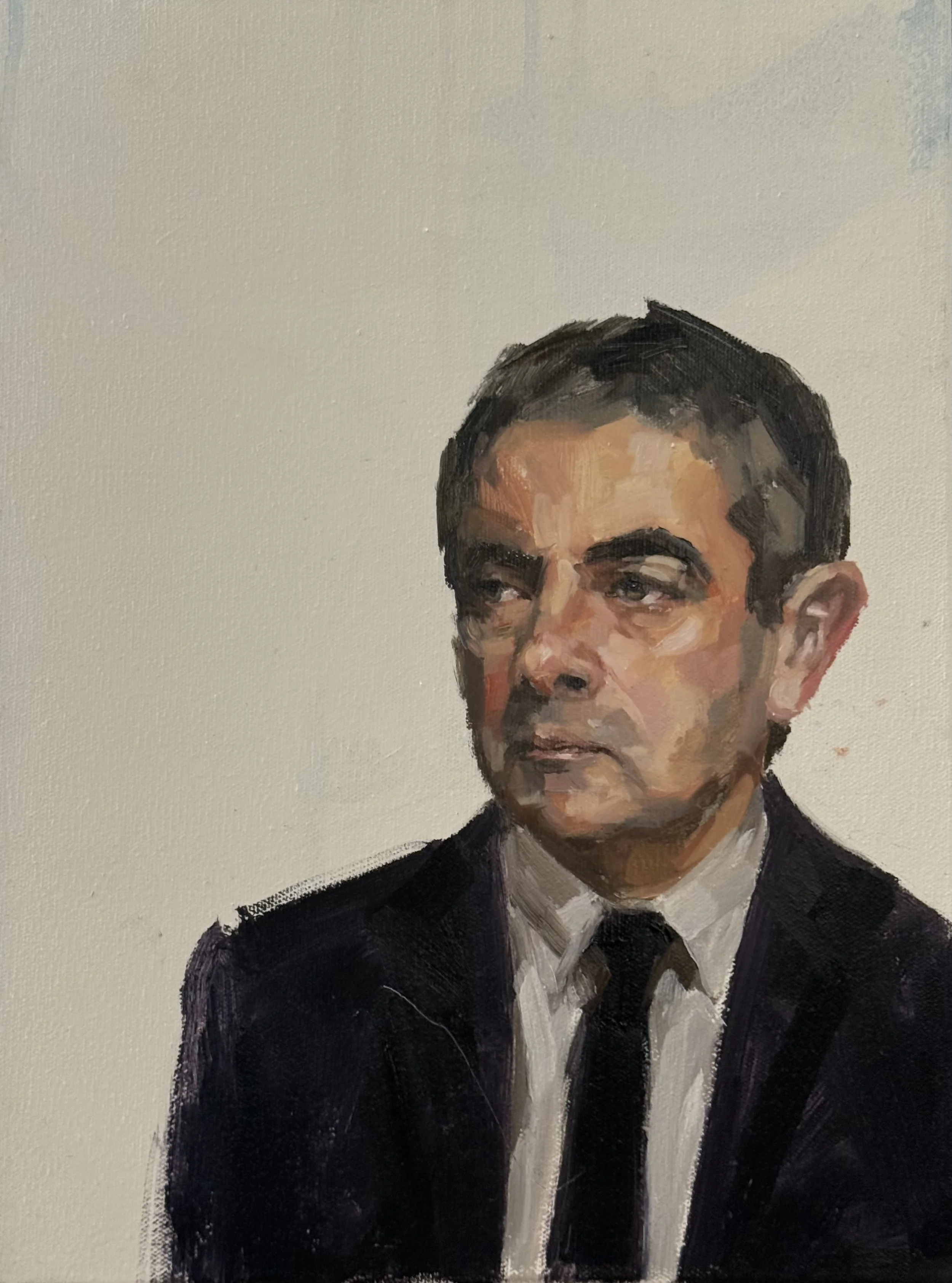
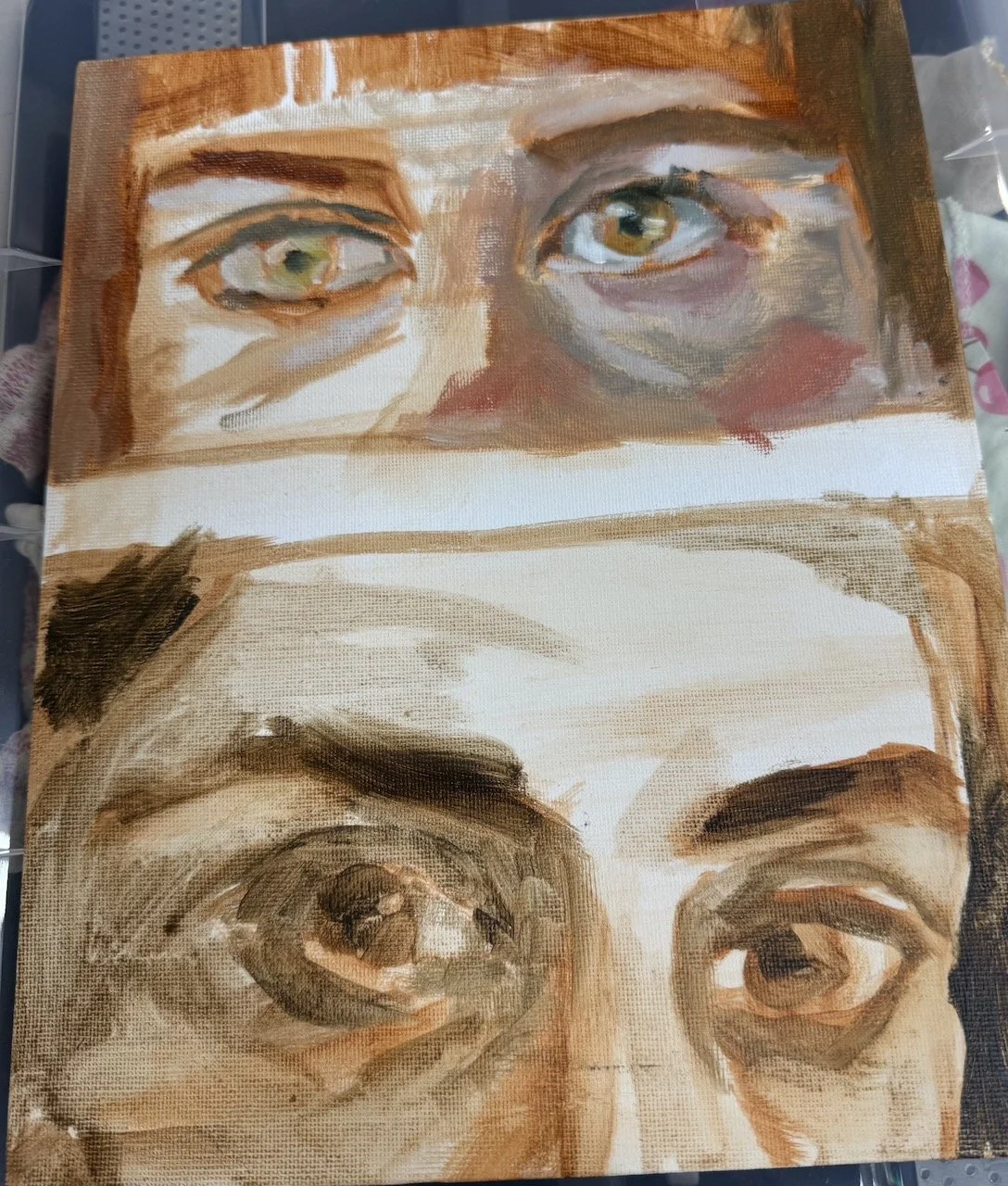
I swapped cerulean blue with Viridian green for my first nose/mouth study, and later used this very same pallet to paint head no 41 - Rowan.
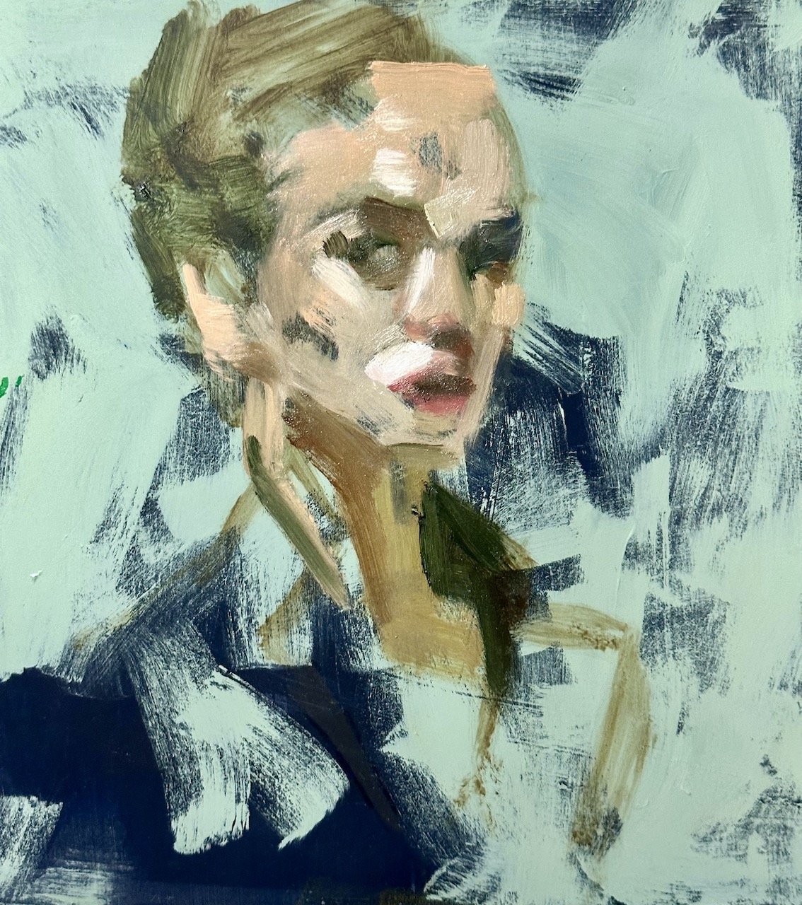
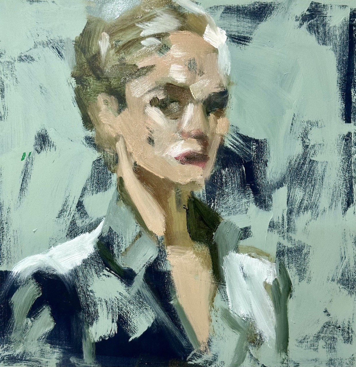
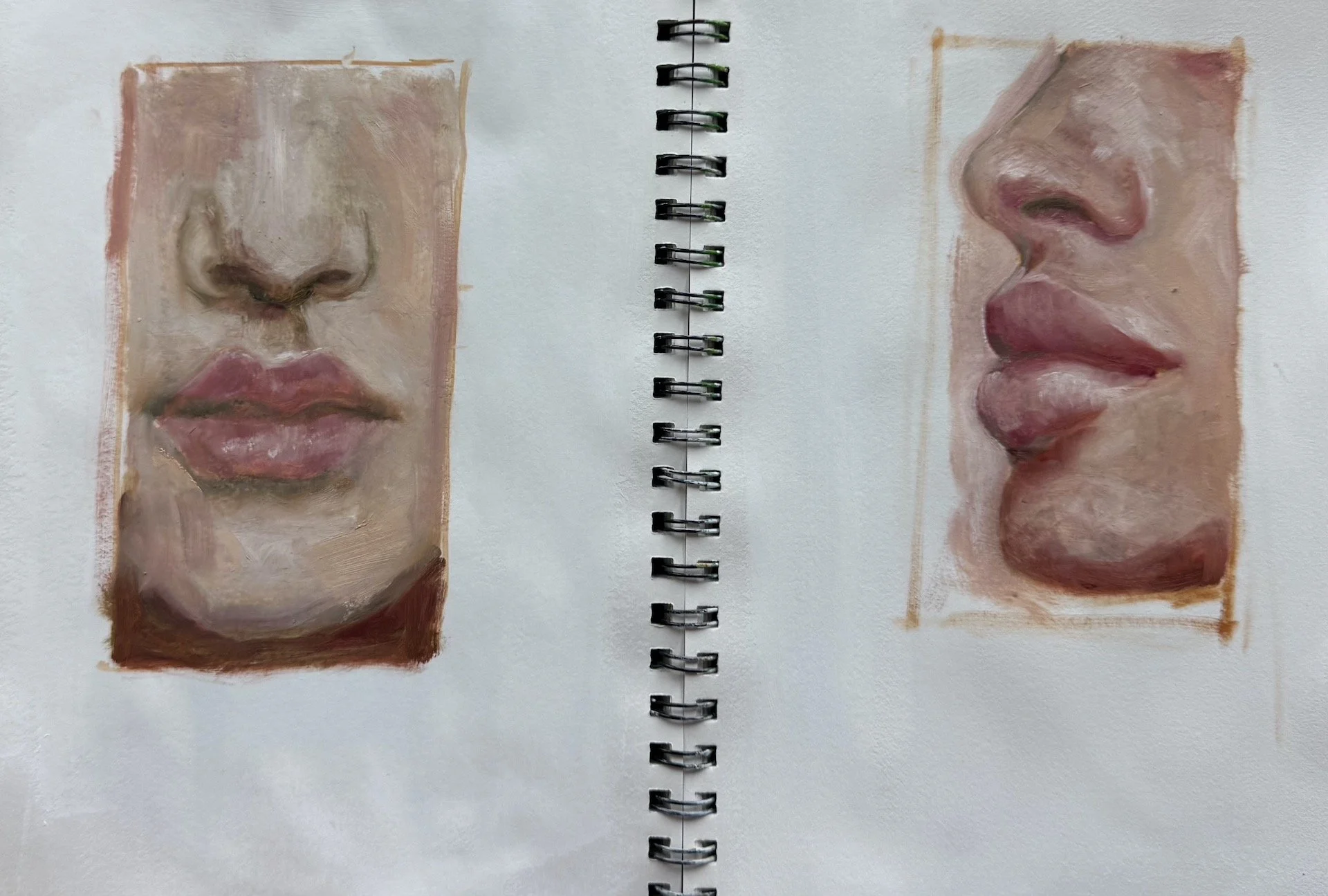
Great work by participants for this difficult area of the face.
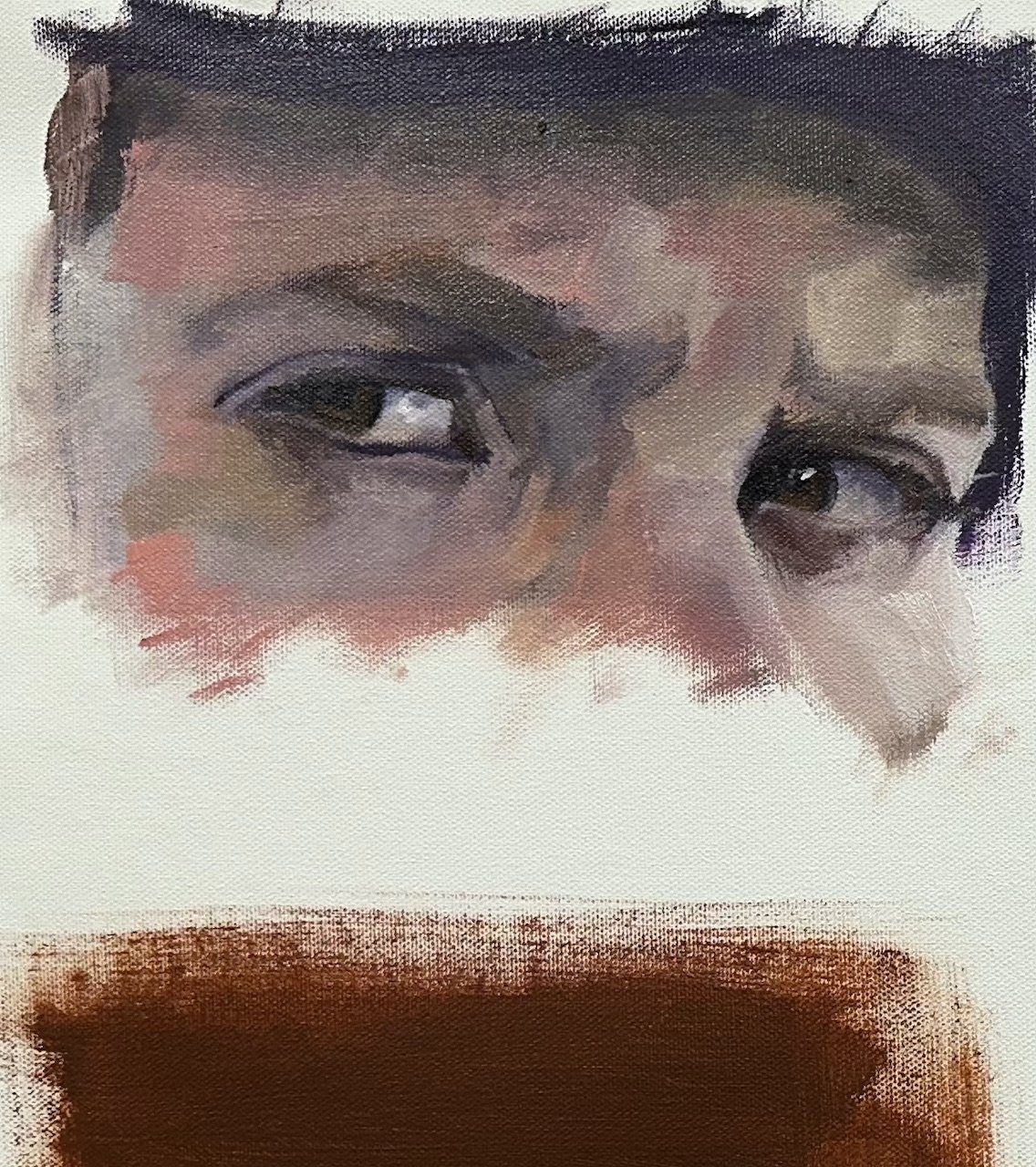
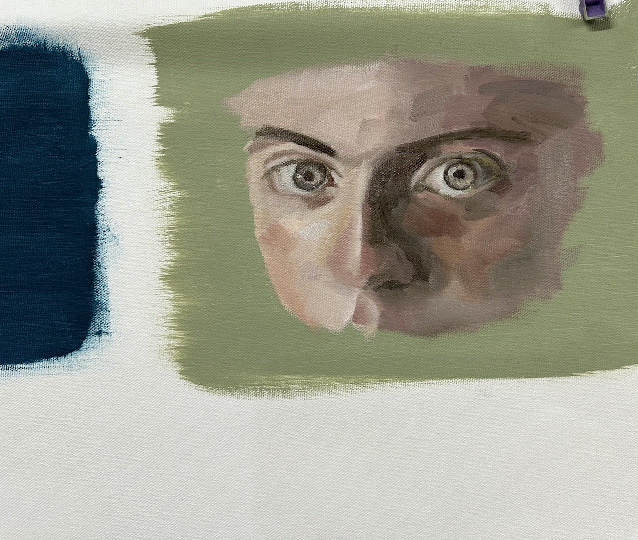
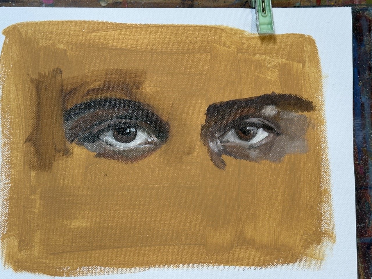
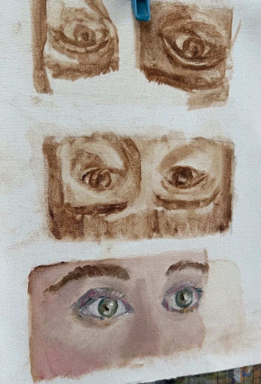
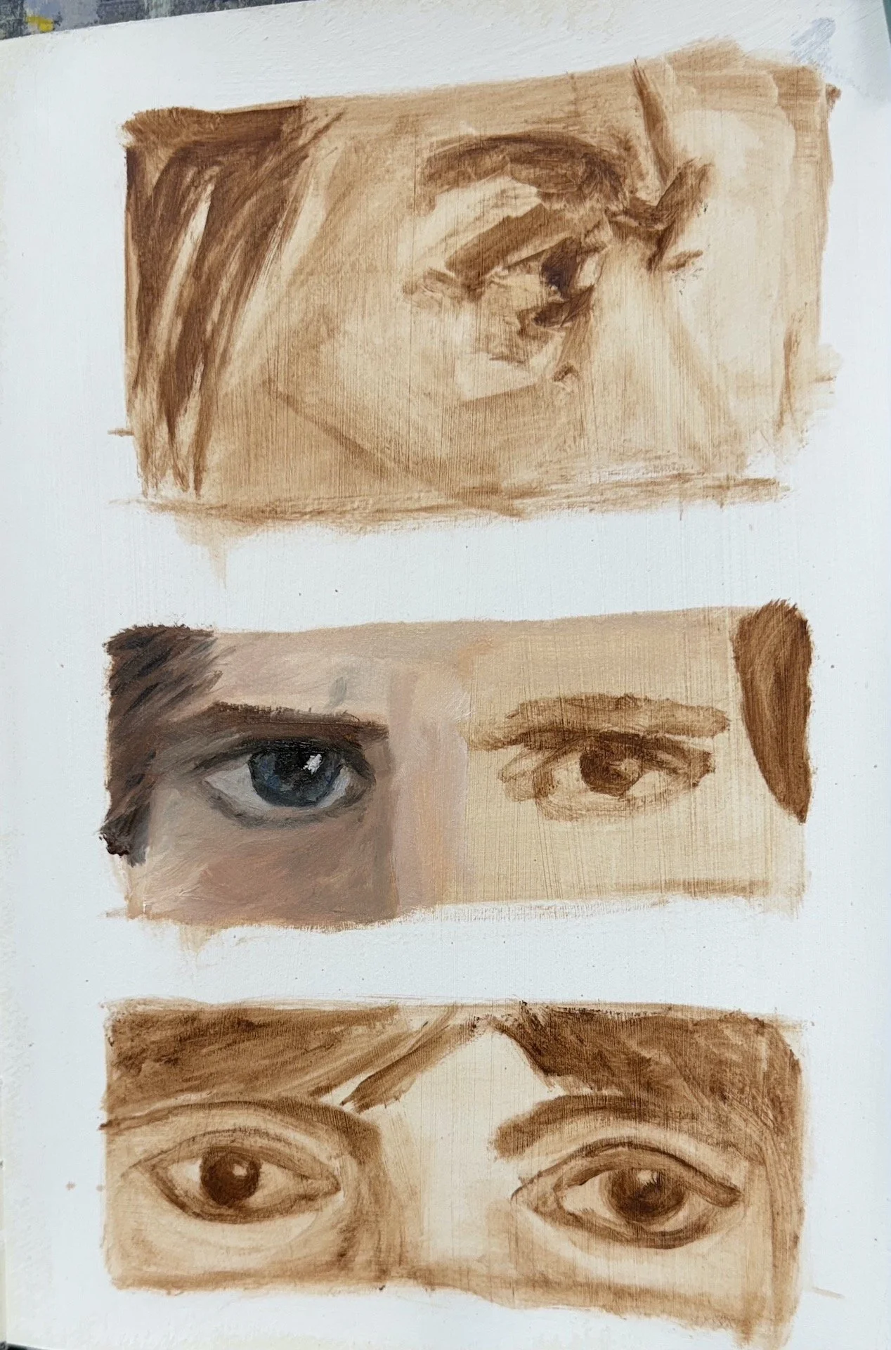
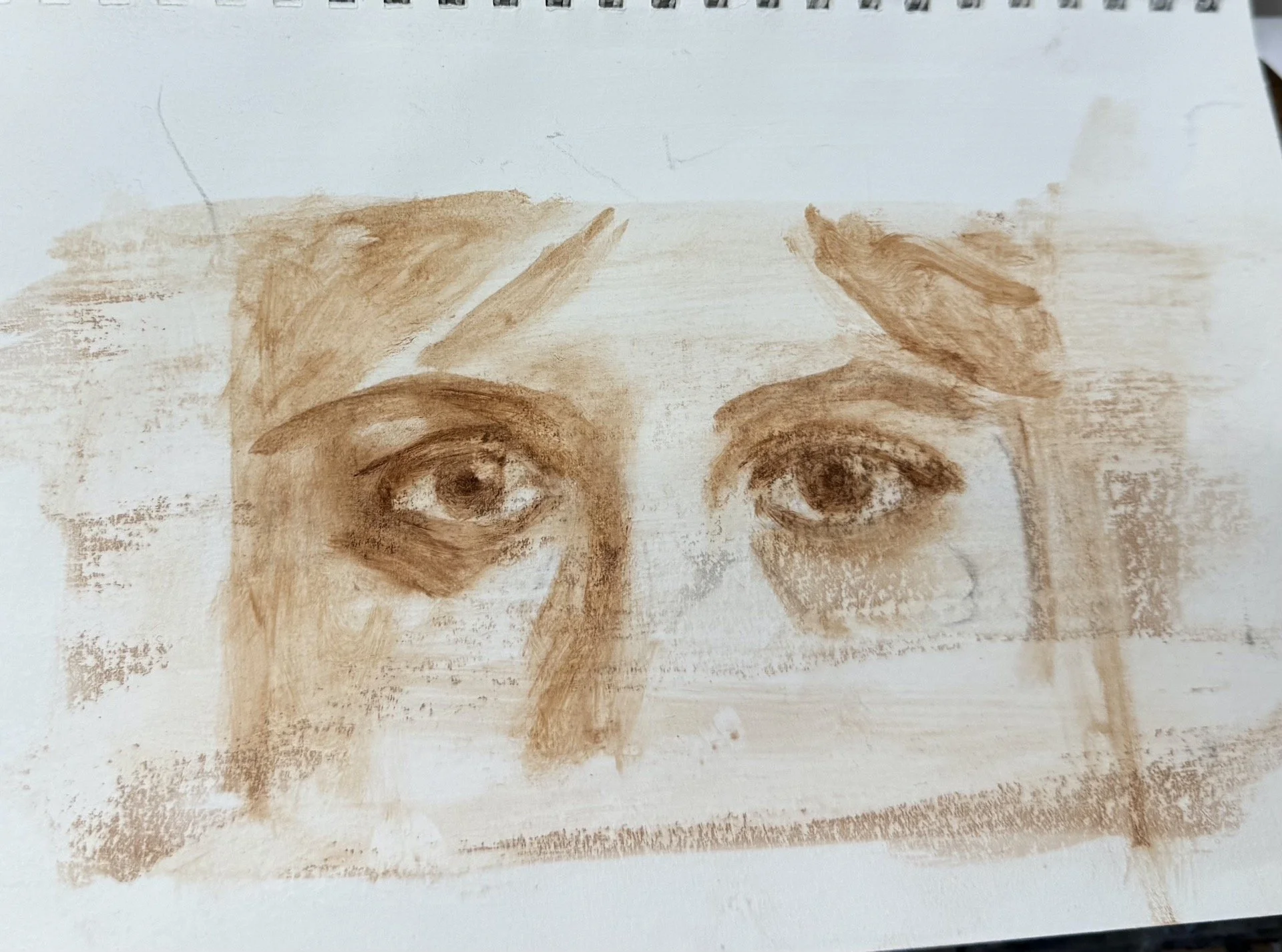
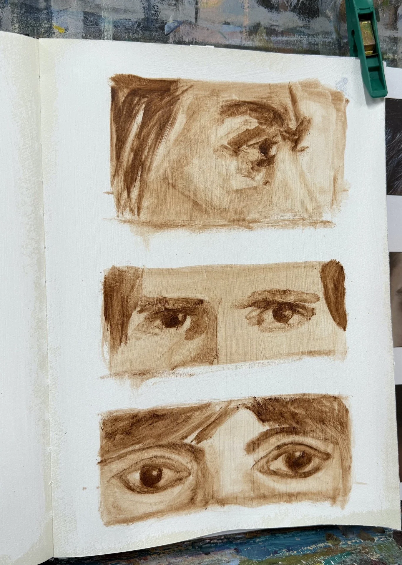
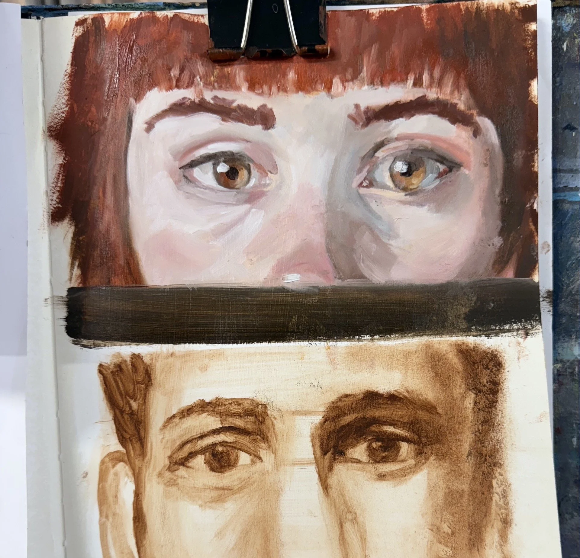
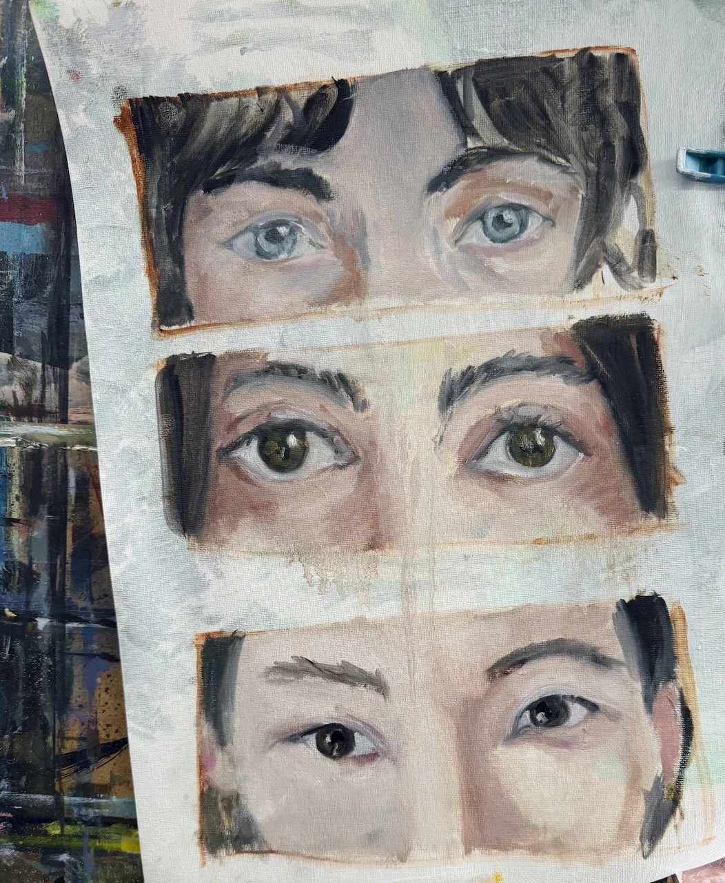
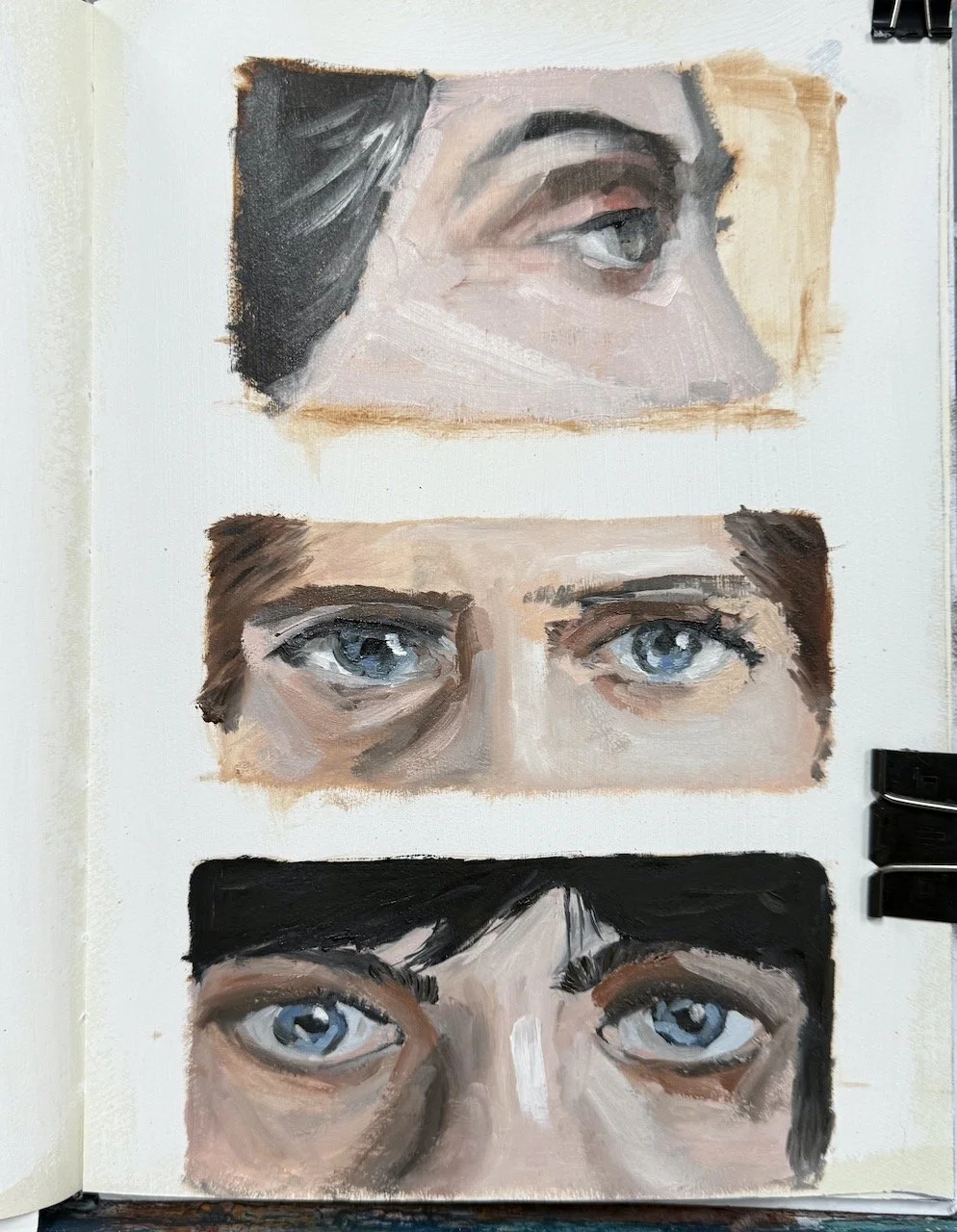
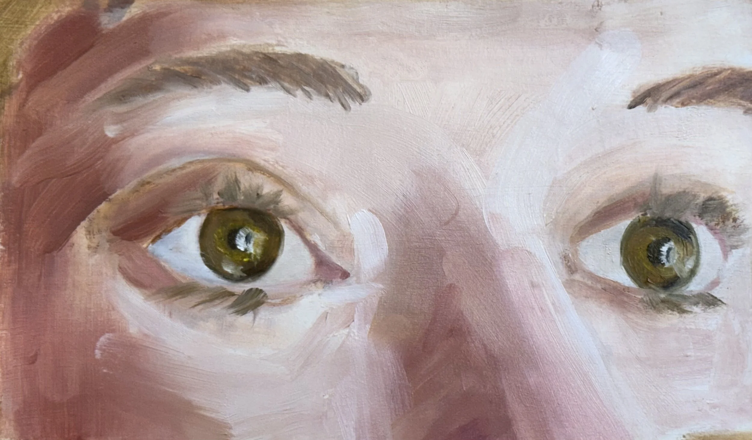
The final two sessions were dedicated to the eyes. For the first session we drew the eyes three times in a tonal painting then painted in one of the eyes leaving the rest for the following week. Figuring out what learning can comfortably fit in a session is part of my lesson prep, so I need to have a bit of a play myself beforehand to figure that out. I learn so much putting a course together and then seeing the outcome, it’s like we all go on this learning journey together.
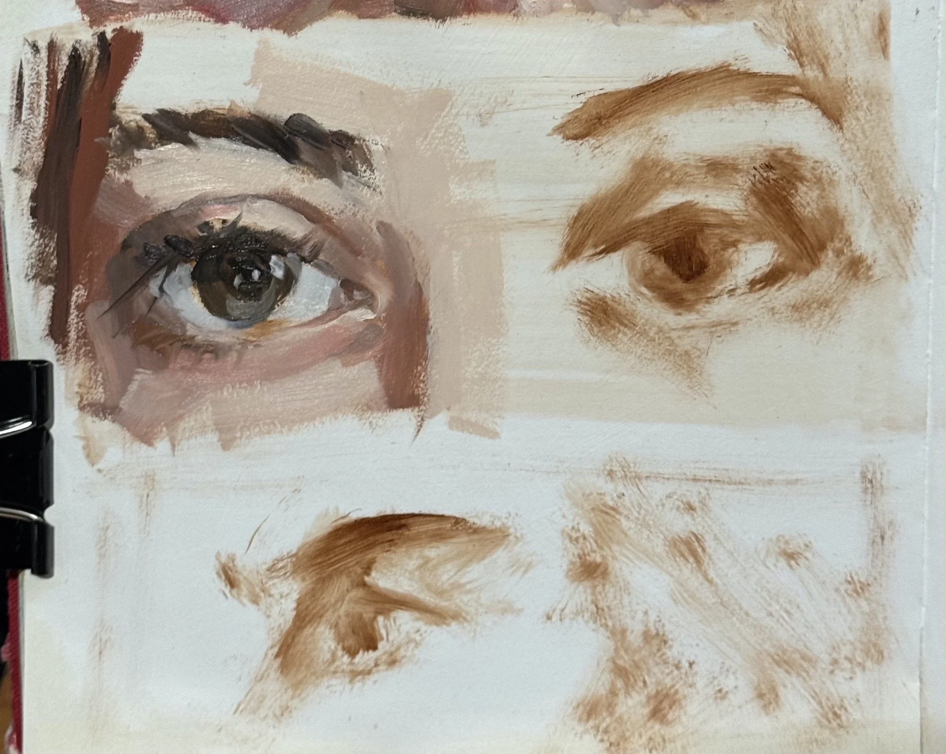
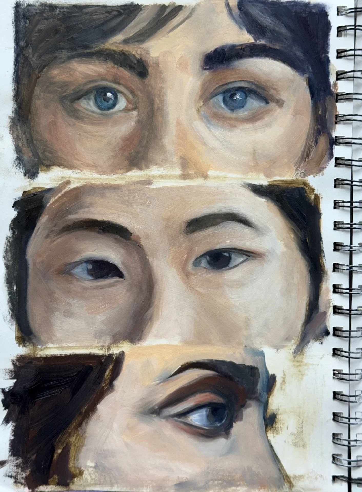
Class work from the first session of the eyes below -
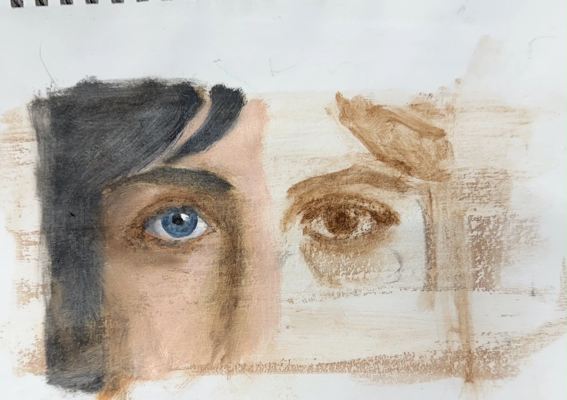
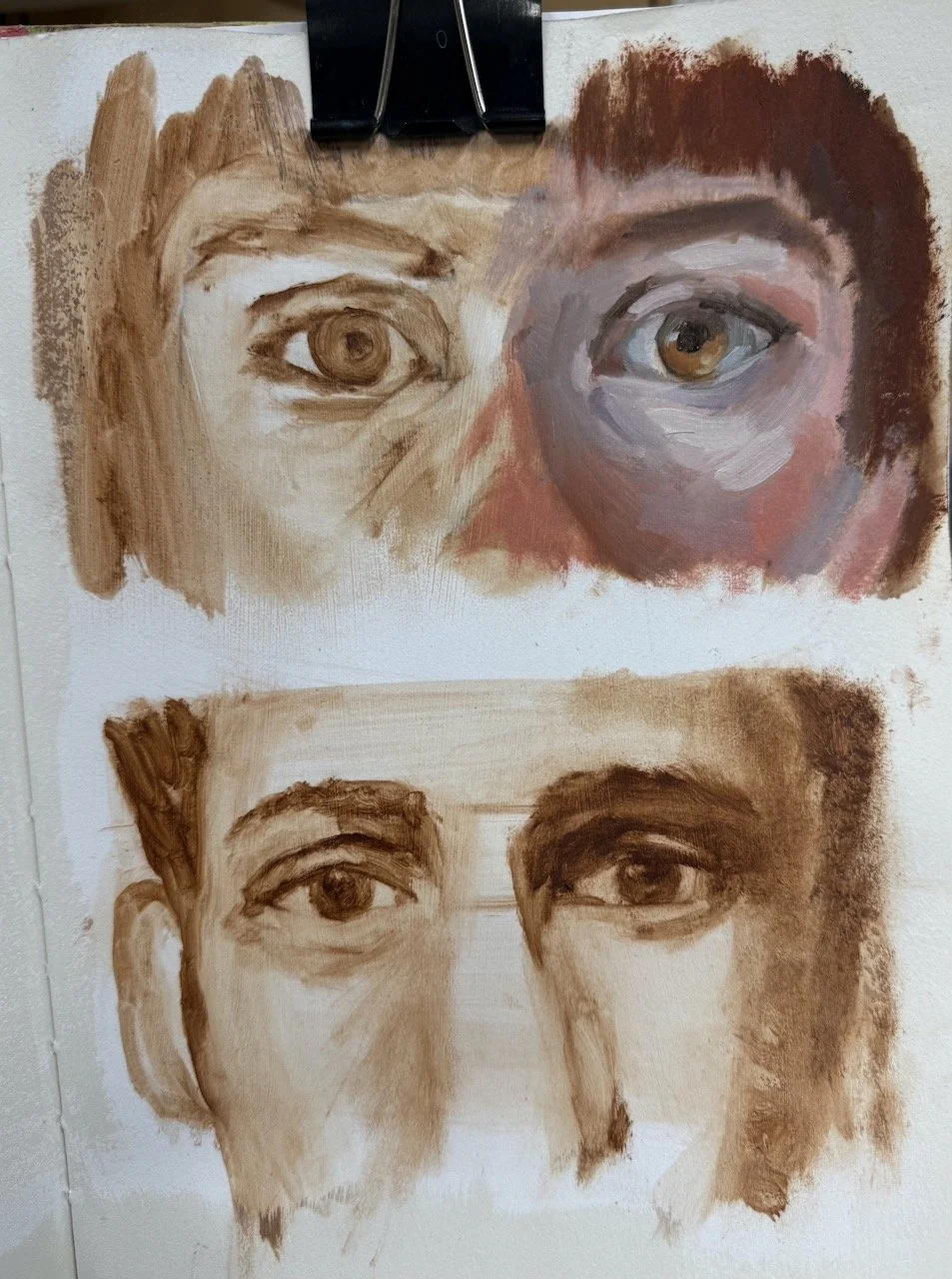
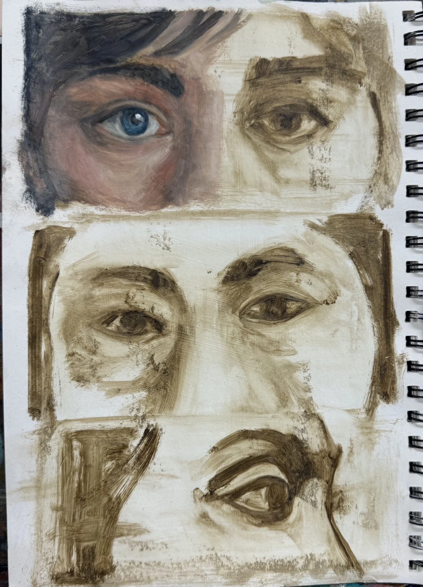
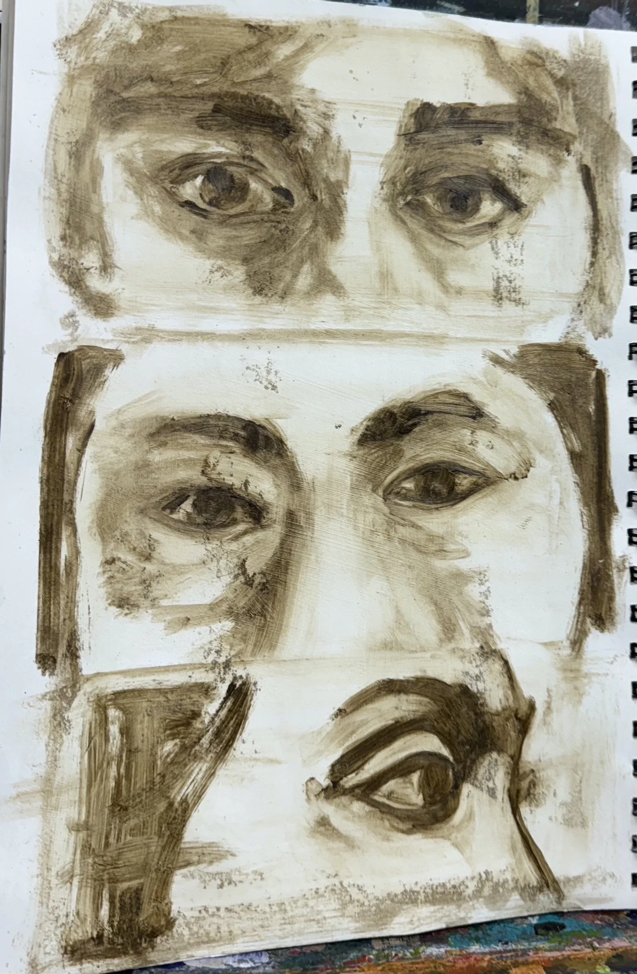
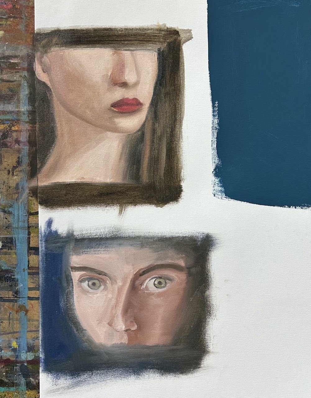
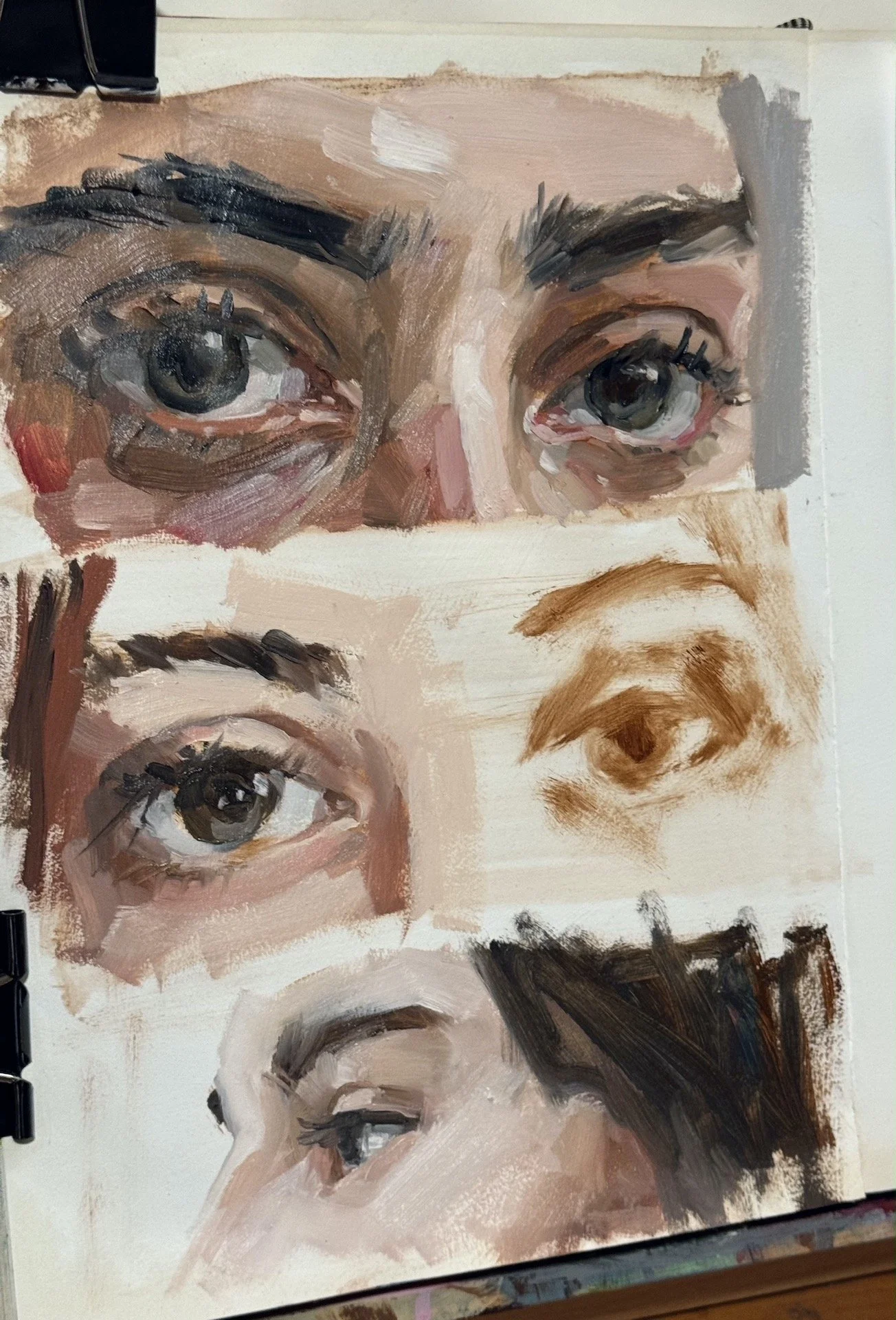
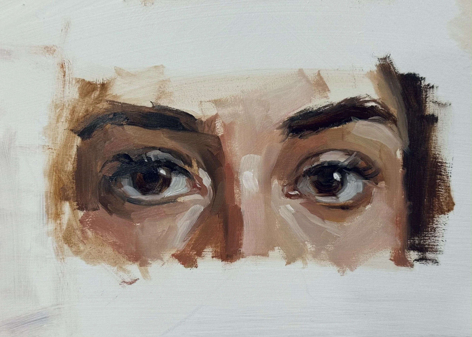
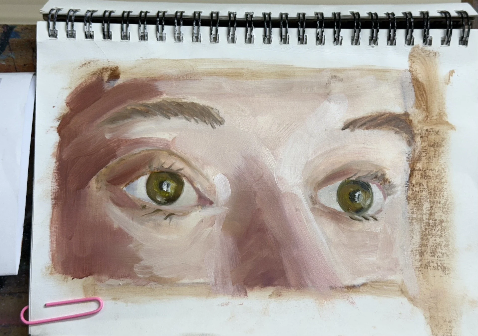
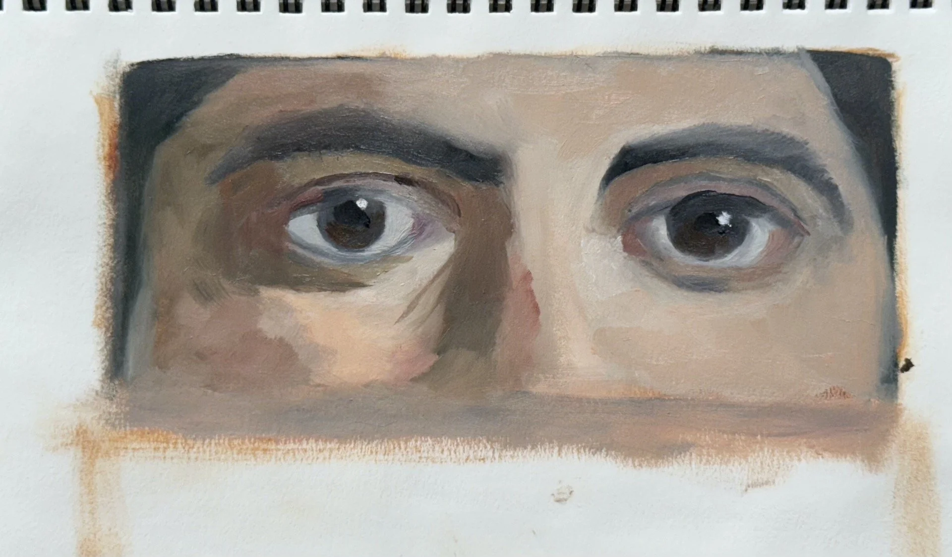
the final session was to complete at least one of the eyes in the alla prima painting style of the previous classes.

Please subscribe using the form above if you want to be notified of upcoming courses and workshops via email.
Sincerely,
Cat.